
Re-imagining a cult yoga brand's digital platforms for an omnichannel fitness future.
ROLE
Responsible for end-to-end
product strategy & design
TIME PERIOD
2021-23
PLATFORMS
Web, iOS
DESIGN FUNCTIONS
UX Research
Interaction Design
Visual Design
Design Systems
Content Design / UX Writing
Information Architecture
COLLABORATORS
1 UX Designer
1 Visual Designer
1 Product Owner
1 Tech Lead + 4 SWEs
1 Set Designer
1 Content Programming Lead
IMPACT
+30% Subscriber Satisfaction
3x User Engagement (WAUs)
+8pp Free-to-Paid Conversion
-40% D30+ Churn Rate
To comply with any non-disclosure agreements, I have omitted, sanitized, and/or obfuscated confidential information in this case study. All information and opinions are my own and do not necessarily reflect the views of Y7 STUDIO or FitLab.
Discovery
UX RESEARCH
Y7 STUDIO® built a cult following for its beat bumping, candlelit hot yoga classes. When COVID abruptly shut down studios, the company rapidly pivoted to keep the brand alive by spinning up a digital SVOD platform with Vimeo OTT.
The stopgap worked, for a while. Loyalists used it through lockdowns, but once doors reopened, they churned back to the studio. Meanwhile, the product was never competitive enough to capture a new persona of at-home yogis who expected Peloton-level polish. Digital revenues fell sharply.
The pandemic, however, revealed an opportunity. Leadership saw that a competitive digital presence could both extend Y7’s reach beyond its urban markets, while increasing the perceived value of its recurring studio memberships. I was brought on as the company’s first digital hire—responsible for shaping product strategy and leading end-to-end product design.
Legacy Persona: Studio Clients
Hundreds of thousands passed through Y7's studios over the past decade. Thousands of loyalists adopted the digital product during lockdowns to preserve their practice.
Pain Points
- Class reservation flow was tedious (7 pages, 40+ clicks).
Digital offering felt flat compared to deeply immersive IRL classes.
- Instruction overlapped with in-studio offerings, with no differentiation.
- Maintaining separate accounts for studio vs. digital was confusing.
Jobs-to-be-Done
- Make it as easy as possible to reserve a studio class.
- Access differentiated digital content that extends the studio.
- Stay connected to favorite Y7 teachers in between studio visits.
- Preserve the "beat bumping, sweat dripping" DNA online.
Opportunities
Offer digital-exclusive, long-tail content that complemented IRL classes.
- Enhance perceived value of memberships with bundled digital access.
- Reduce friction by unifying IRL/digital offerings into one platform.
New Persona: At-Home Yogis
A new audience unlocked by the pandemic: suburban and rural yoga enthusiasts who’ve sampled billion-dollar platforms like Peloton. They expect polished production, deep libraries, and seamless discovery—but find yoga instruction on those platforms shallow and unsatisfying.
Pain Points
- Y7's library felt thin and lower quality compared to competitors.
- Poor discoverability made finding the "right" class a chore.
- Music integration was clunkier than all-purpose platforms.
Jobs-to-be-Done
- Level up at-home yoga practice with challenging digital instruction.
- Easily discover classes that match their mood, body focus, or goals.
- Experience hit music as an intentionally curated layer of the practice.
Opportunities
Differentiate by offering challenging, authentic online yoga instruction.
- Compete on discoverability and long-tail content, not sheer library size.
- Become the first yoga-centric platform with curated, synced hit music.
Design Challenges
User research made the trade-offs clear: Vimeo’s off-the-shelf solution couldn’t scale to our needs. Core problems in content discoverability, hit music integration, and seamless omnichannel account management went unaddressed.
This led to our core design challenge: how do we design an SVOD product that could serve both studio clients and at-home yogis, while positioning Y7 for long-term digital growth?
Success Criteria
SVOD Findability
and Discoverability
Users should be able to surface relevant, long-tail content quickly.
Measured by the browse-to-play rate, avg. time-to-play, and the catalog utilization rate.
SVOD Subscriber
Engagement & Retention
Subscribers should be using the SVOD platform regularly, offering a sticky experience that keeps subscribers renewing over the long-term.
Tracked by weekly/monthly active users, avg. classes taken per user per month, and churn rate.
SVOD Acquisition,
Activation & Conversion
The product should feel compelling enough to trial, and valuable enough to pay for.
Validated through free trial starts, first-session abandonment, the free-to-paid conversion rate, and D45 retention.
Ease of Studio
Reservation
Studio clients should be able to seamlessly book classes.
Validated through avg. time-to-reservation and reservation abandonment.
Improving SVOD
Discoverability
INTERACTION DESIGN
VISUAL DESIGN
INFORMATION ARCHITECTURE
CONTENT DESIGN
Vimeo OTT wasn’t built for the unique UX demands of fitness SVOD. Unlike category leaders such as Peloton, Obé, and Glo Yoga, the platform’s off-the-shelf UX had numerous drawbacks:
- No faceted navigation → users couldn’t combine duration, instructor, intensity, or body focus filter.
- Manual curation dependency → staff had to continuously re-organize videos into static collections.
- Low-information class cards → only title, thumbnail, and duration surfaced, missing key context.
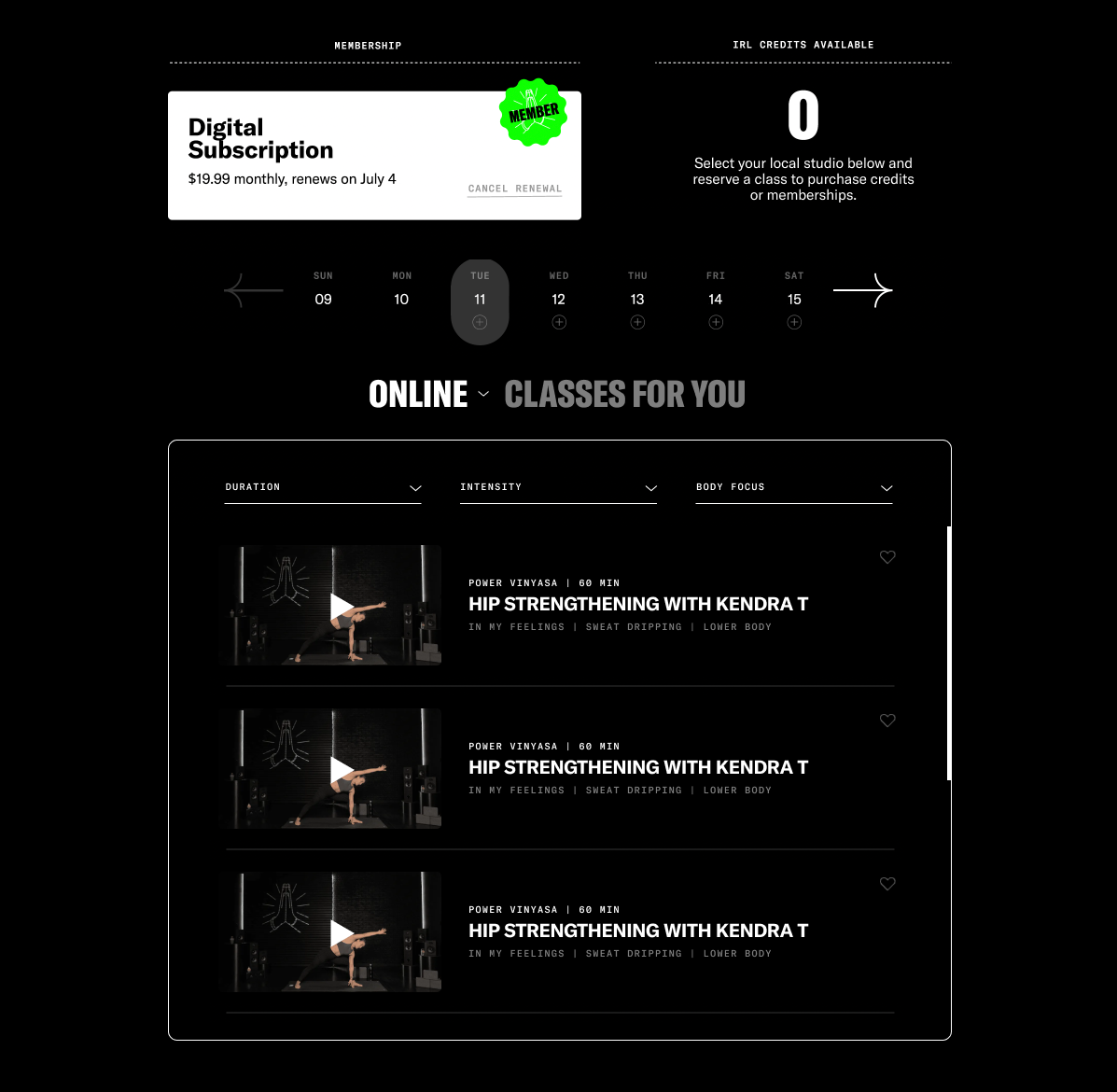
This meant much of Y7's long-tail, evergreen content library was functionally invisible—resulting in low browse-to-play and catalog utilization rates, and an average time-to-play of over two minutes. With plans to 10x content production, this couldn't scale.
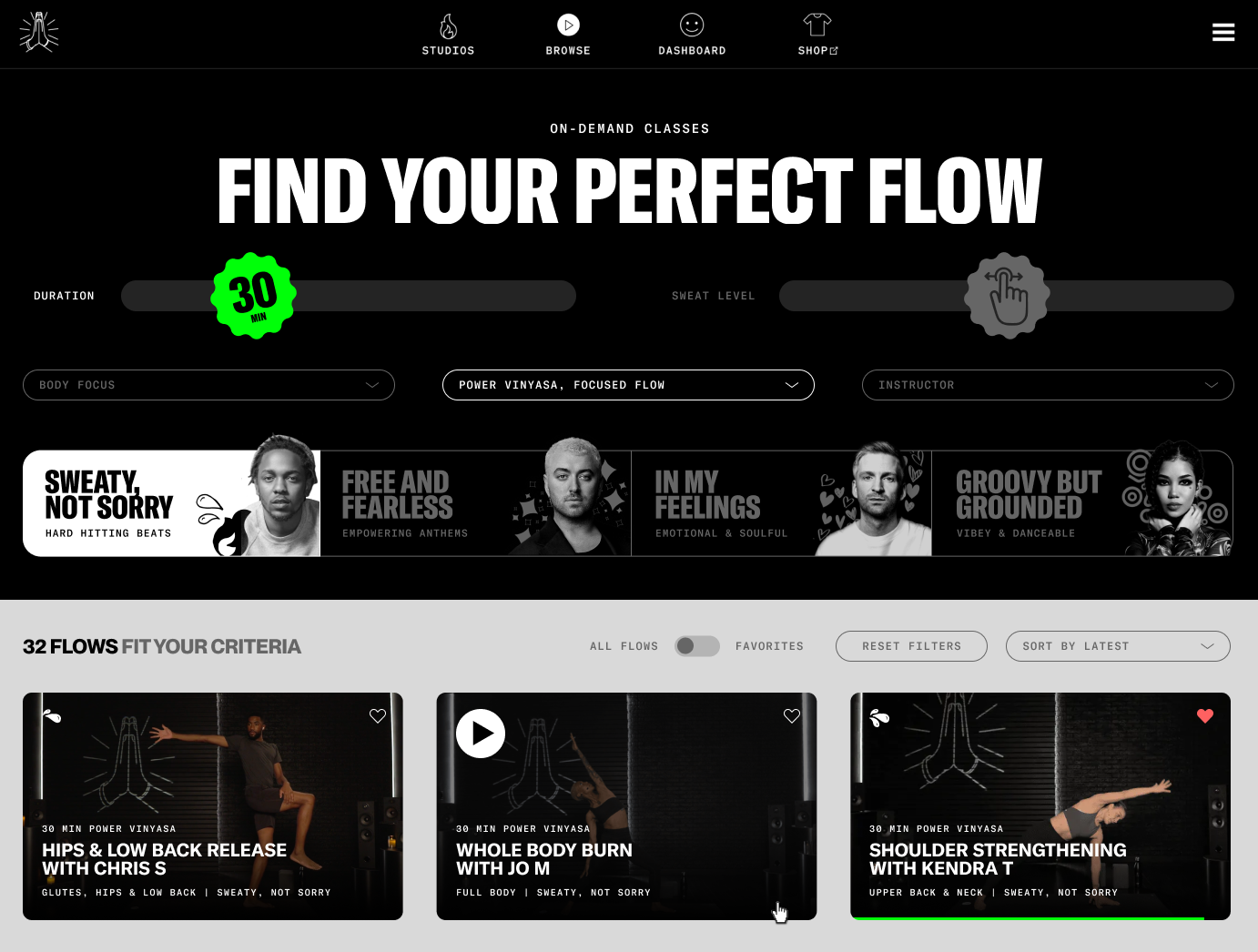
I set out to design a tailored UX with discoverability top-of-mind. The result: a playful, brand-forward browse UX that allowed users to rapidly find their perfect class, cutting average time-to-play in half while increasing catalog utilization.

Before: Single-attribute collections offered a discoverability workaround for a small content library, but were tedious for users to sort through and staff to curate.

Competitor Obé’s browse page set a benchmark: powerful faceted navigation that filtered a clean grid of content that surfaced relevant class context.

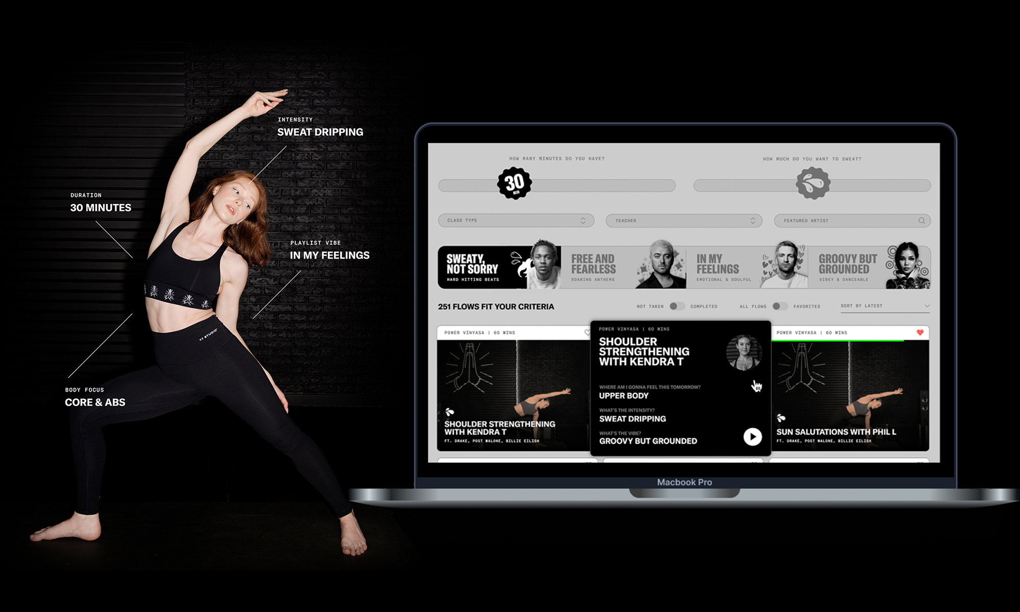
To anchor the new experience, I adopted a clean grid-card layout familiar from leading fitness platforms. Each card surfaced the metadata that mattered most—class type, body focus, intensity, vibe, and music cues—so users could make informed choices at a glance.
After defining our information architecture, a new faceted navigation interface was placed in a left sidebar—updating the grid in real time as filters were selected. Popular facets were expanded by default, while less common ones were tucked into accordions to reduce visual clutter without limiting choice.
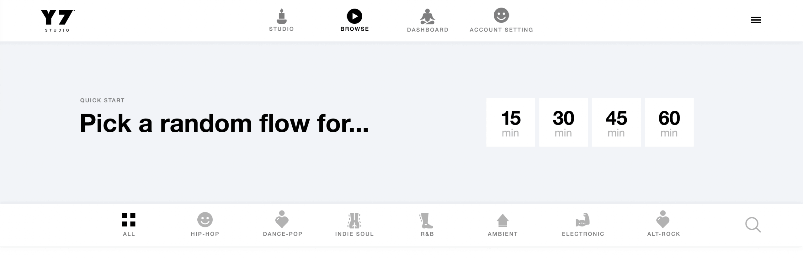
I ideated a one-click quick start picker that let users simply choose a duration and launch a class to reduce decision fatigue. Further, I elevated the genre facet into a full-width row directly above the grid. While not a widely-utilized facet, this subtle emphasis reinforced that music was core to the product experience.
Pre-launch user testing revealed the quick start functionality felt jarring by reducing user agency. I re-designed this above-the-fold section by moving the sidebar facets into a consolidated, quiz-style layout. Duration and intensity were presented as draggable sliders that retained the speed of the original quick start idea, while boosting user agency and offering a playful, tactile micro-interaction.
The genre bar evolved into a novel “vibe” facet that better reflected how instructors actually programmed: multi-genre playlists anchored by a clear intention. I defined four core "vibes" in a content design workshop with top instructors, each expressed in Y7’s brand voice and brought to life through rotating artist headshots. This offered greater utility for users and clarity to instructors, while better emphasizing our new hit music integration.
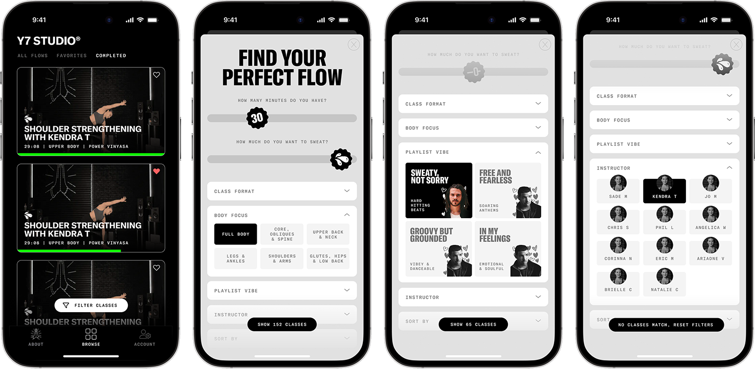
For our native iOS app, the grid collapsed into a single scrollable column. Facets moved into a full-height bottom sheet that incorporated our quiz-style slider elements, with other facets in accordions below. As filters were selected, the matching class count updated in real time to offer instant feedback without leaving the sheet.
Class Detail Modal
A major IxD decision was modal vs. new page for class detail. A dedicated page could help SEO and acquisition, but a modal kept subscribers in flow—letting them preview a class and back out without losing filters. I prioritized in-session engagement and chose the modal.
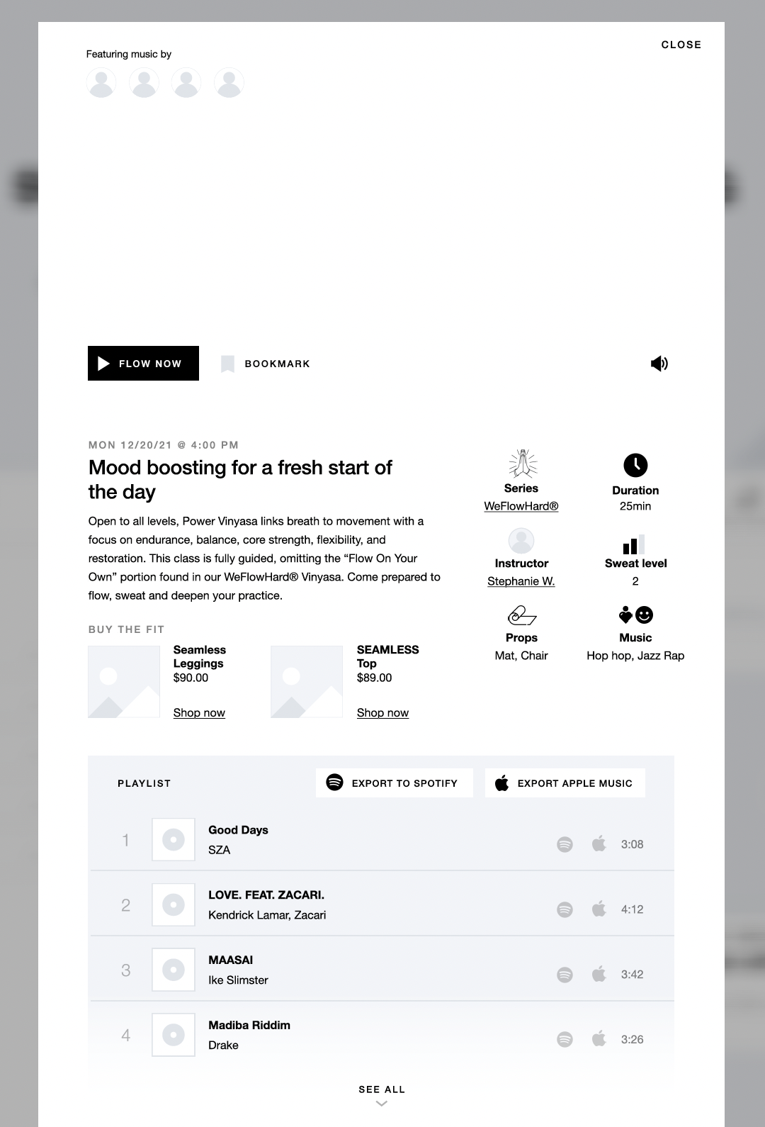
The new pre-class modal featured full class details and playlist, key artist thumbnails, Y7 apparel shopping links, and CTAs to start the class, favorite it, or begin a trial.
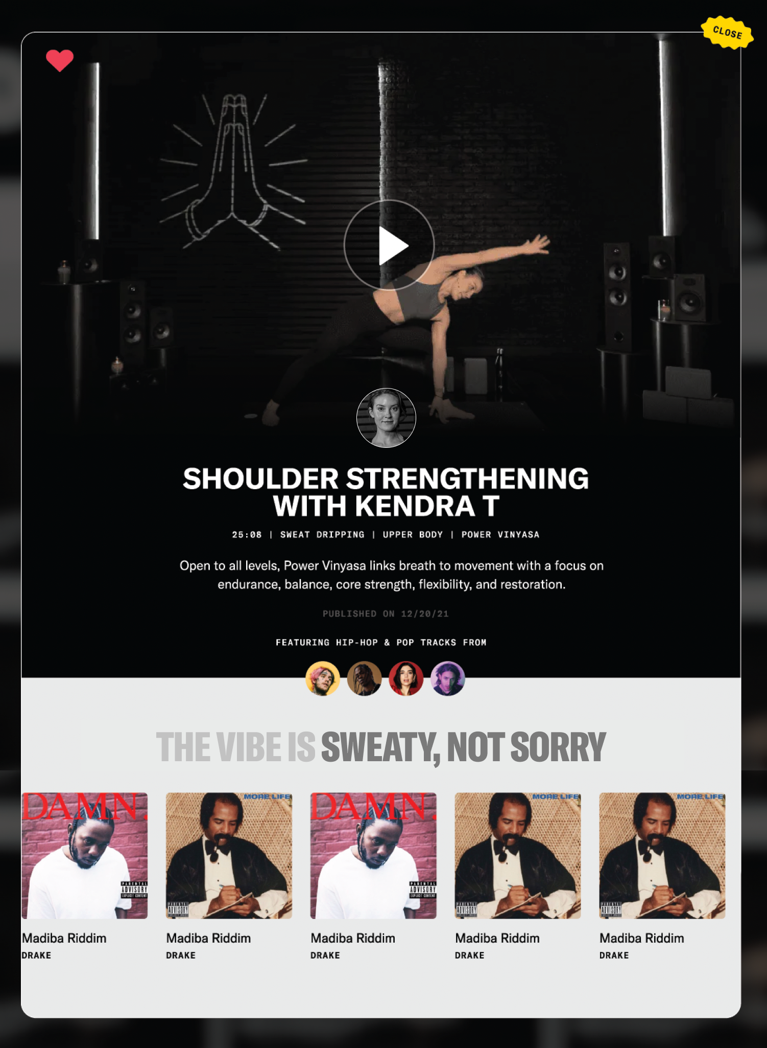
The final modal layout eliminated awkward white-space gaps and introduced a clearer visual hierarchy. With low uptake for Spotify/Apple Music links, the playlist was instead converted into a more visually impactful, continuous carousel that eliminated vertical scrolling.
Designing the Operations
to Enable a Competitive Platform
SERVICE DESIGN
PROCESS DESIGN
Content Strategy
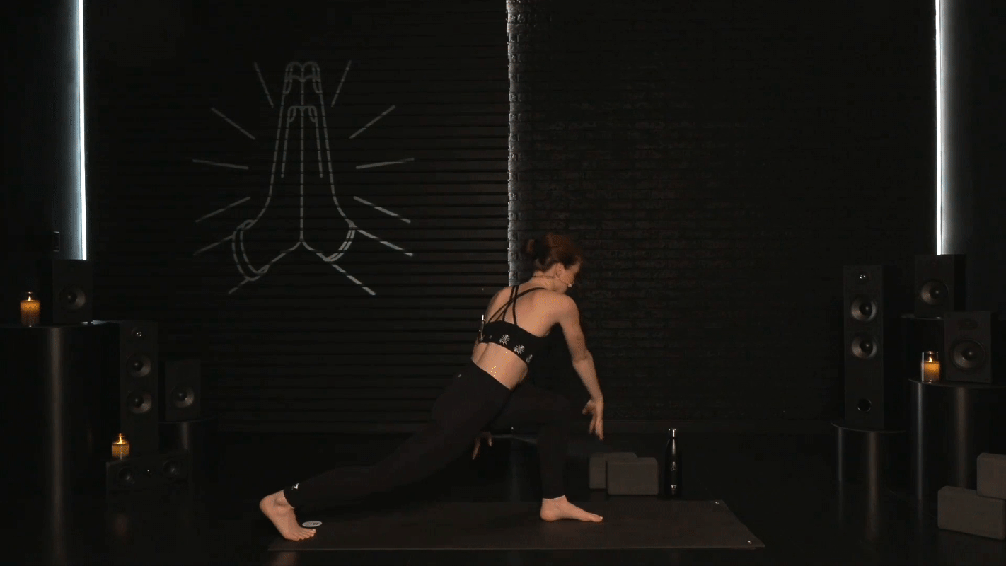
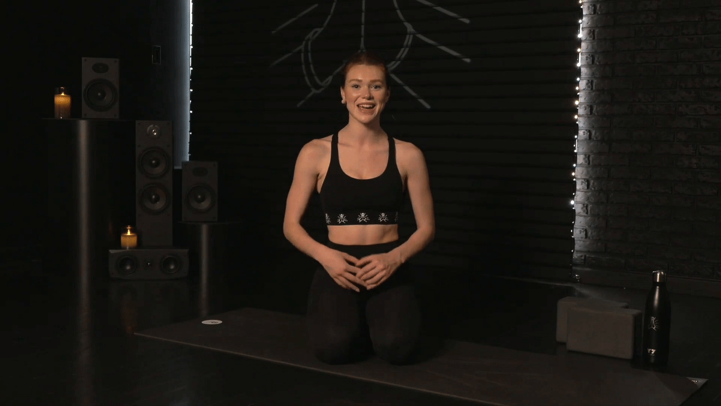
As a video-centric product, set design played a crucial role in ensuring cohesive visual design. Bucking the industry trend of bright minimalist sets, we leaned into Y7’s signature darker, candlelit aesthetic to differentiate ourselves. I was inspired by gritty urban elements that drew from the brand's Brooklyn roots.
Crafting a Brand-Forward
Experience
VISUAL DESIGN
DESIGN SYSTEMS
CONTENT DESIGN
Set Design
As a video-centric product, set design played a crucial role in ensuring cohesive visual design. Bucking the industry trend of bright minimalist sets, we leaned into Y7’s signature darker, candlelit aesthetic to differentiate ourselves. I was inspired by gritty urban elements that drew from the brand's Brooklyn roots.
The result featured talent framed in front of a blacked-out garage door and brick wall, accented by candles and stacked black speakers. We used a gobo projector to display Y7's logomark on the door, which could quickly be swapped out for brand partnerships.
Lastly, I introduced a secondary camera angle, allowing us to bookend classes with a more intimate close-up shot—mimicking the feeling of sitting beside the instructor in a private session.
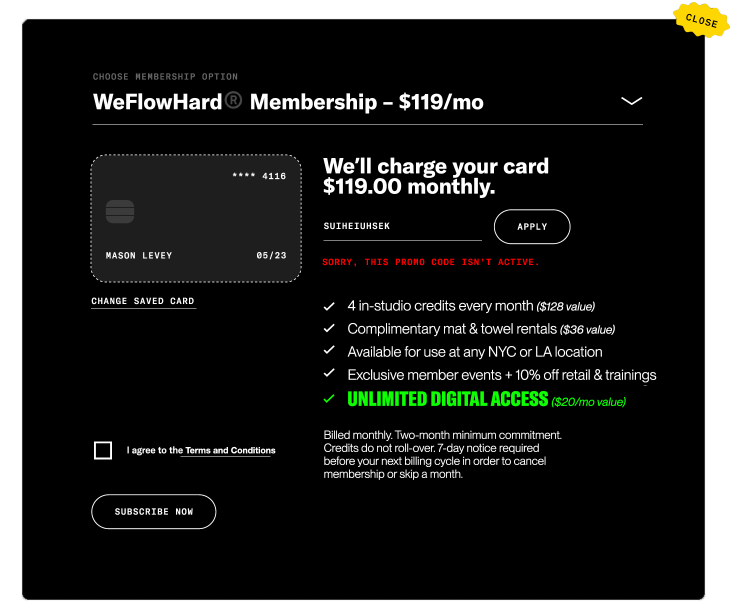
Removing Friction in
Reservation Flows
INTERACTION DESIGN
VISUAL DESIGN
UX WRITING
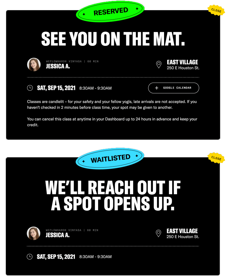
The studio booking experience was outdated, slow, and confusing—adding friction to one of the brand’s most critical customer touchpoints. Journey mapping and analytics showed it could take up to seven pages and 40+ clicks to reserve a single class. Clients often abandoned the process or missed offers they were eligible for—hurting both satisfaction and revenue.
The goal was to make booking a studio class feel more intuitive, less frustrating and dramatically reduce time-to-reservation. The result: a single, intuitive modal-driven flow that was fast and frictionless for users, with stronger commercial outcomes for the business through dynamic logic.
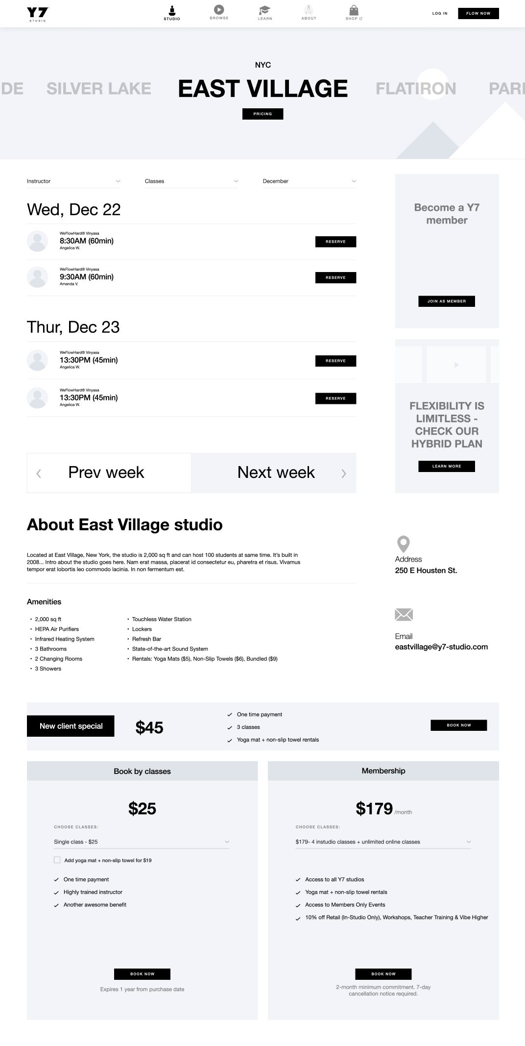
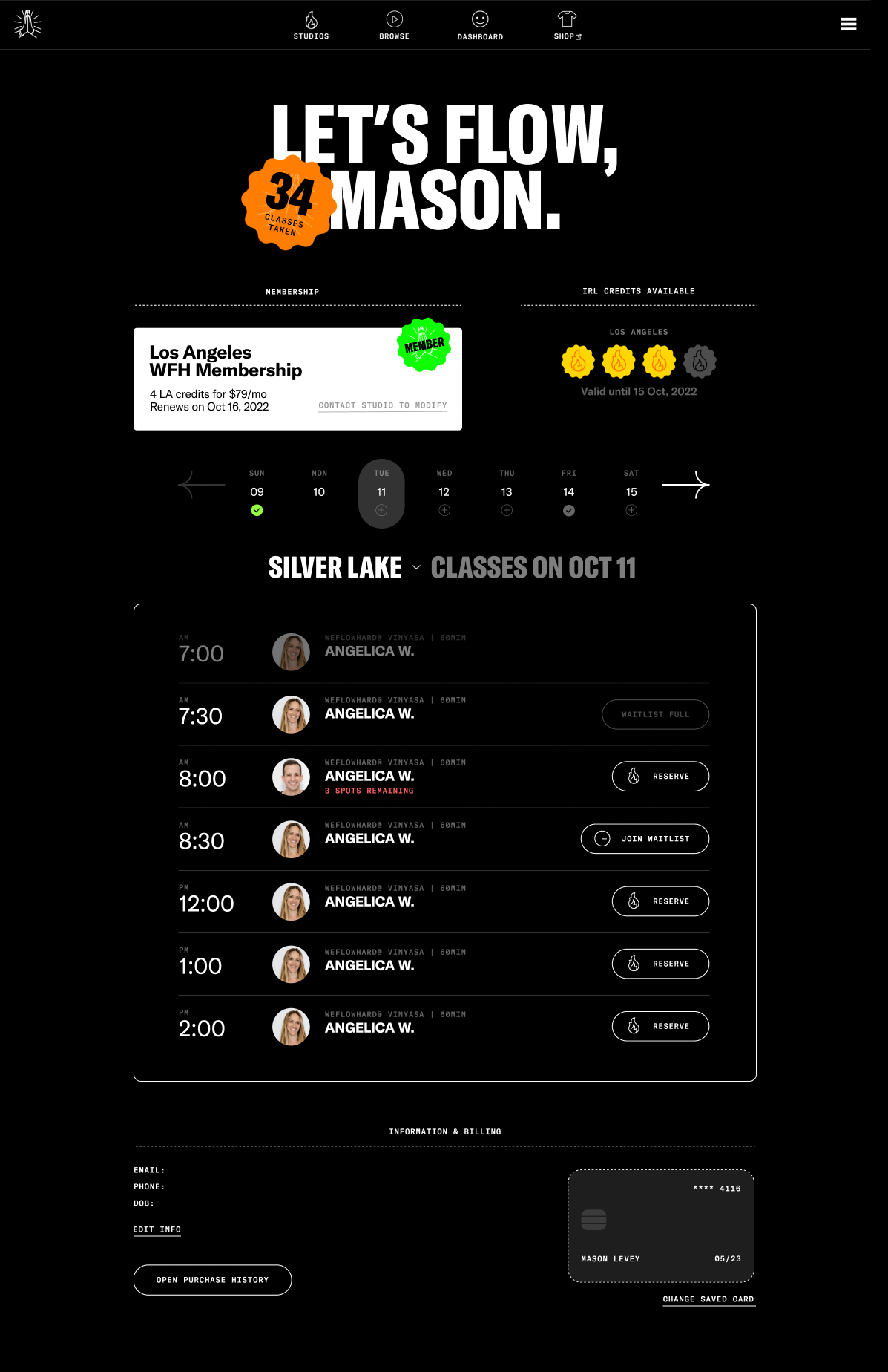
I consolidated three separate sub-pages for each studio (Info, Pricing, Schedule) into a single page accessible from the homepage in one click.
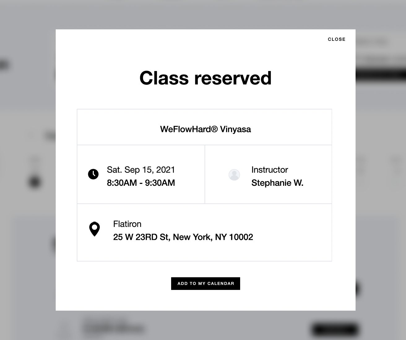
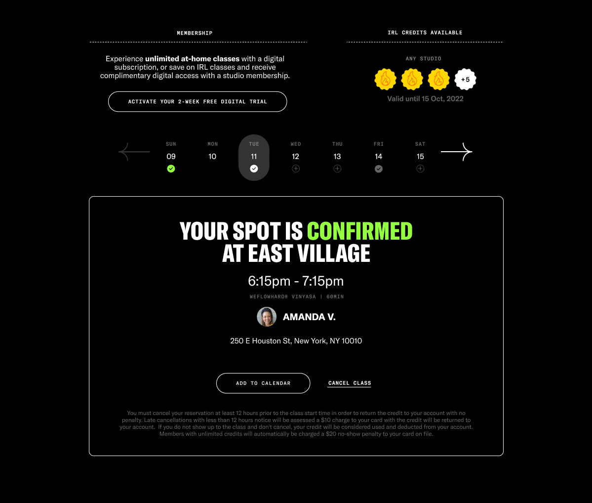
When attempting to reserve a class with an active membership or credits, a modal confirmed the reservation instantly. If not, the full purchase flow now also stayed on the page—contained in a modal—to reduce friction.
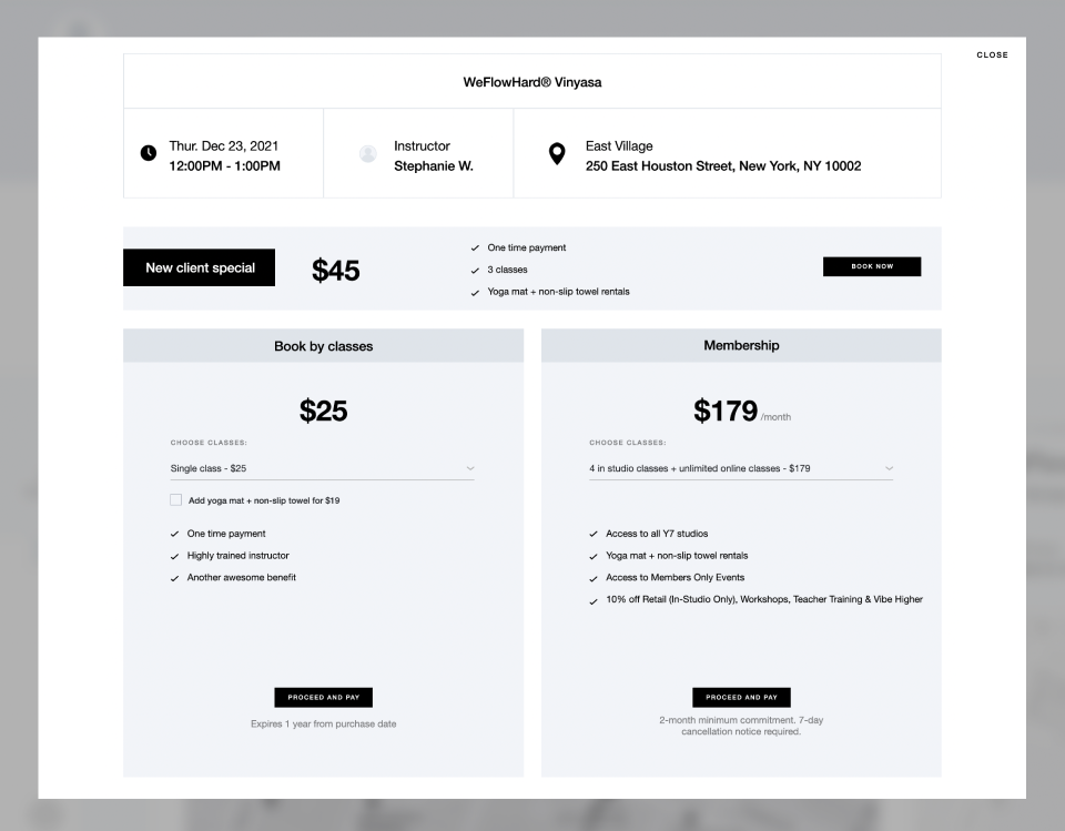
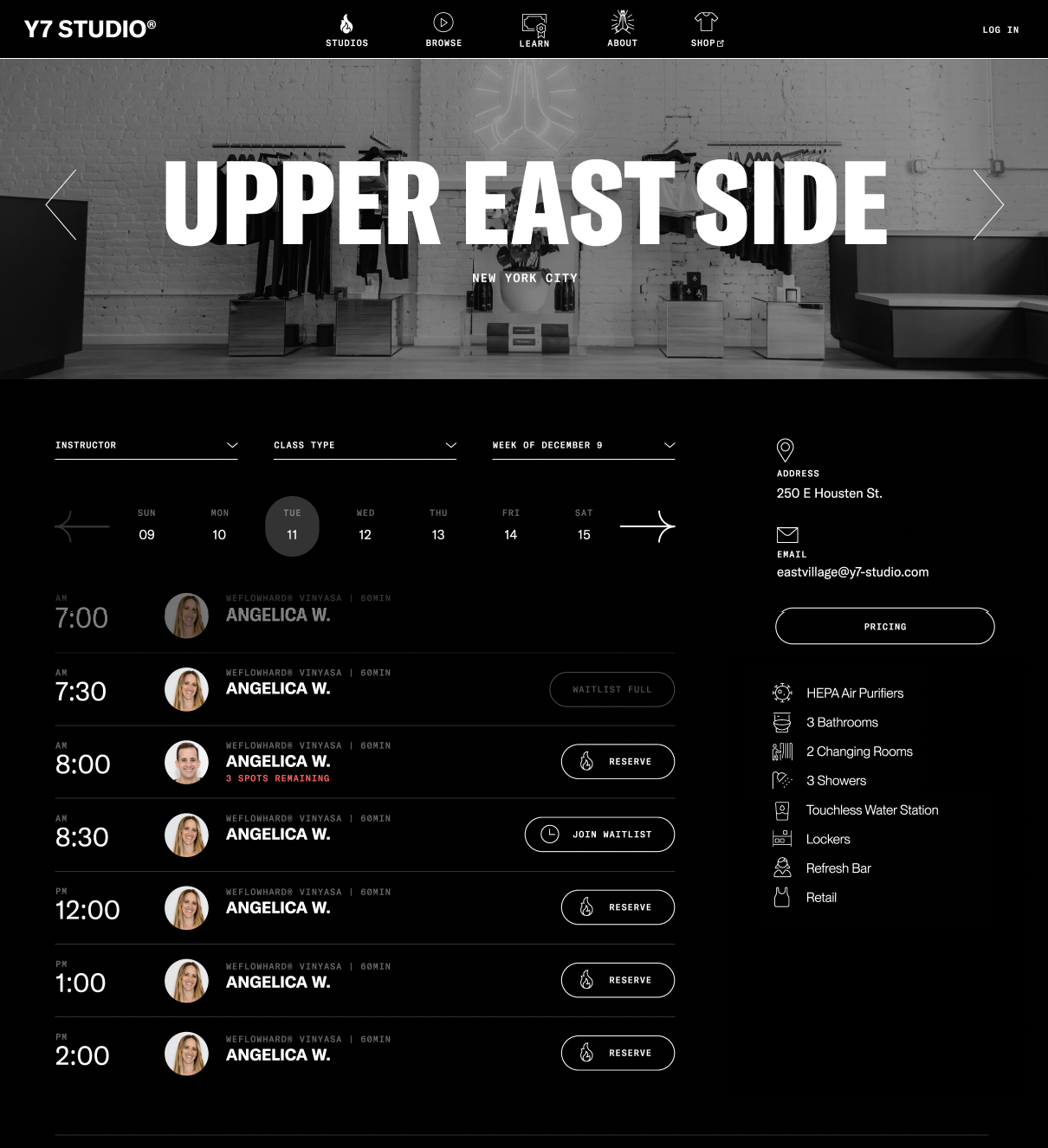
To prevent the page from requiring excessive vertical scrolling, I introduced a date picker to limit the number of visible classes and moved studio information into a right sidebar.
I refined modal logic to align with business priorities, which significantly boosted recurring revenue. Rather than offering all three pricing options at once, the following logic was put into place:
New clients saw an intro offer first.
Returning clients were first prompted to save with a recurring membership.
In all cases, a one-click fallback to a fixed-credit option remained.
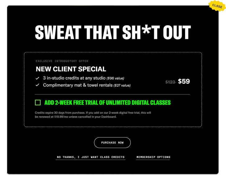
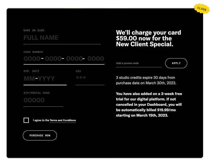
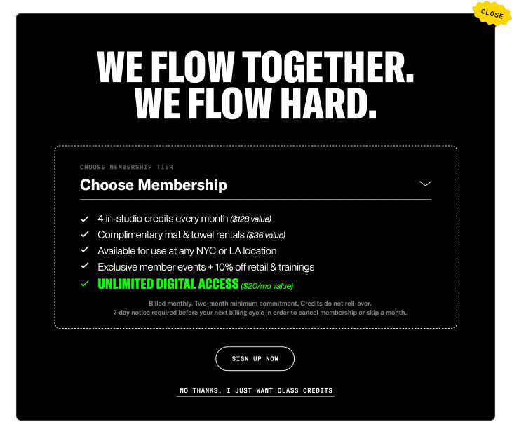
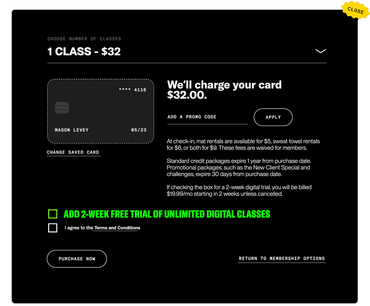
Through adding a simple checkbox to both the new client offer and fixed credit purchase flows, users could seamlessly start an unlimited digital free trial—if eligible—without disrupting their class reservation (memberships now already included this access). This subtle UX change drove a double-digit lift in SVOD trial starts after implementation.
Building an
Omnichannel Dashboard
INTERACTION DESIGN
VISUAL DESIGN
UX WRITING
Mirroring the same frustrations in reserving a class, it was also a tedious process for clients to view, change, or cancel their upcoming class reservations. I designed a dashboard where clients could quickly manage upcoming reservations and their studio membership/SVOD subscription.
To reduce friction further, this dashboard also served as a hub to rapidly reserve a studio class or start a class in under three clicks. To gamify the experience, they'd be also able to see how many total classes they've taken with the brand (both IRL and at-home).
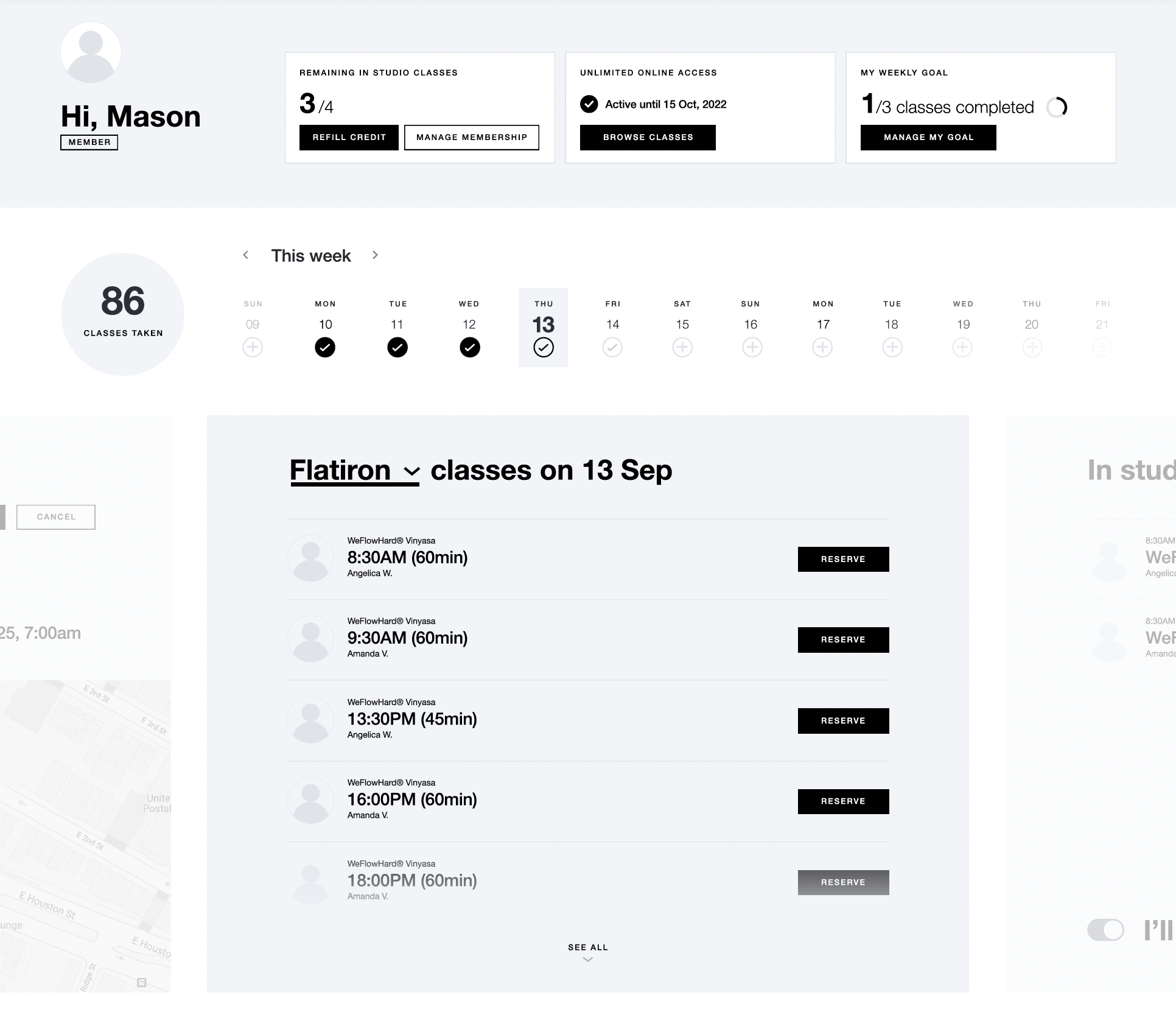
An interactive date picker would quickly surface a one-click booking option for their preferred studio or the ability to view/manage an existing reservation for that day.
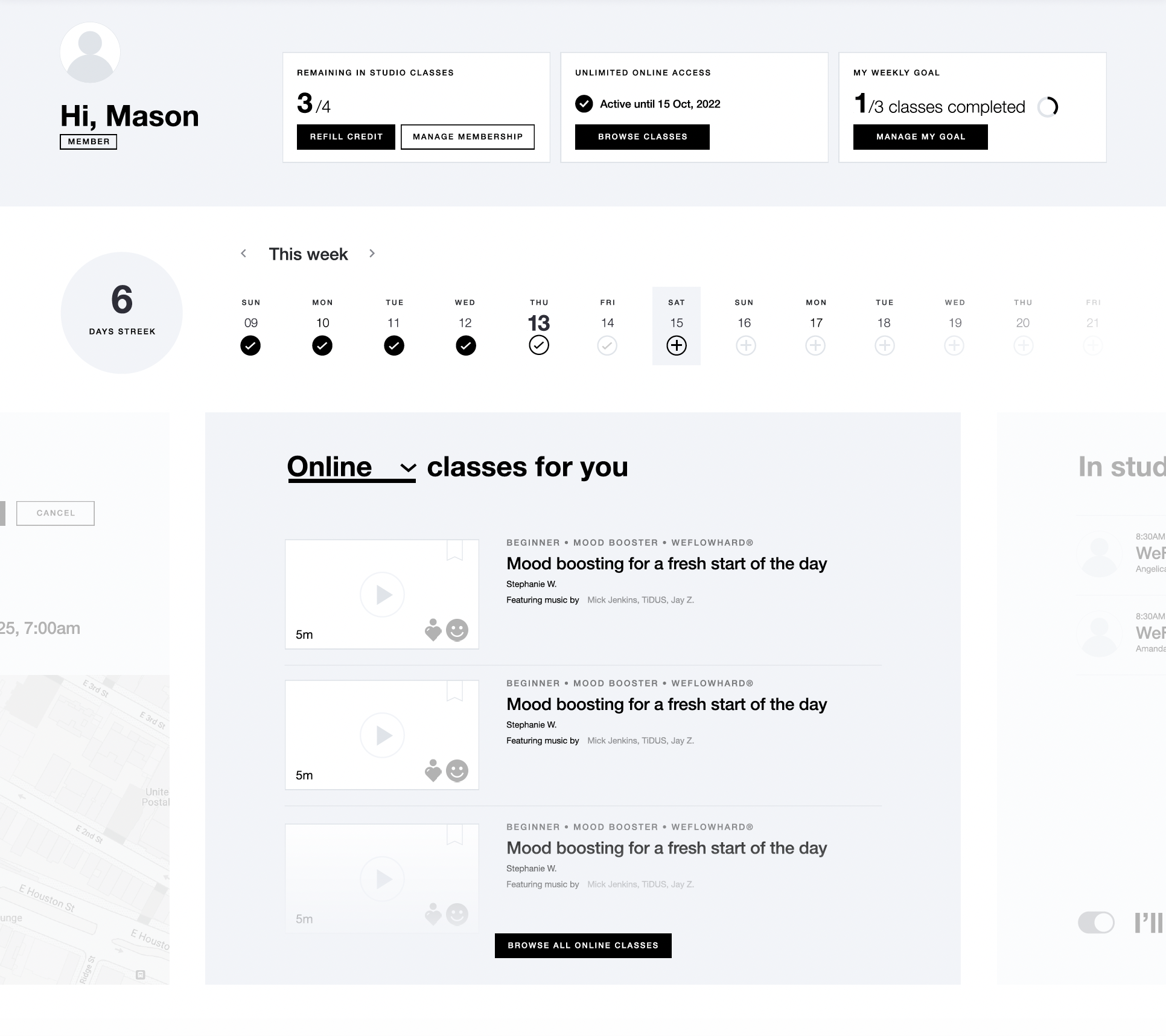
This interface also served as a quick start into digital on-demand classes, which was shown by default for SVOD-only subscribers.
Designing the Operations
to Enable a Competitive Platform
SERVICE DESIGN
PROCESS DESIGN
Content Strategy
As a video-centric product, set design played a crucial role in ensuring cohesive visual design. Bucking the industry trend of bright minimalist sets, we leaned into Y7’s signature darker, candlelit aesthetic to differentiate ourselves. I was inspired by gritty urban elements that drew from the brand's Brooklyn roots.
Crafting a Brand-Forward
Experience
VISUAL DESIGN
DESIGN SYSTEMS
CONTENT DESIGN
Set Design
As a video-centric product, set design played a crucial role in ensuring cohesive visual design. Bucking the industry trend of bright minimalist sets, we leaned into Y7’s signature darker, candlelit aesthetic to differentiate ourselves. I was inspired by gritty urban elements that drew from the brand's Brooklyn roots.
The result featured talent framed in front of a blacked-out garage door and brick wall, accented by candles and stacked black speakers. We used a gobo projector to display Y7's logomark on the door, which could quickly be swapped out for brand partnerships.
Lastly, I introduced a secondary camera angle, allowing us to bookend classes with a more intimate close-up shot—mimicking the feeling of sitting beside the instructor in a private session.
Improving Acquisition
+ Activation
GROWTH DESIGN
CONTENT DESIGN
VISUAL DESIGN
Landing Page
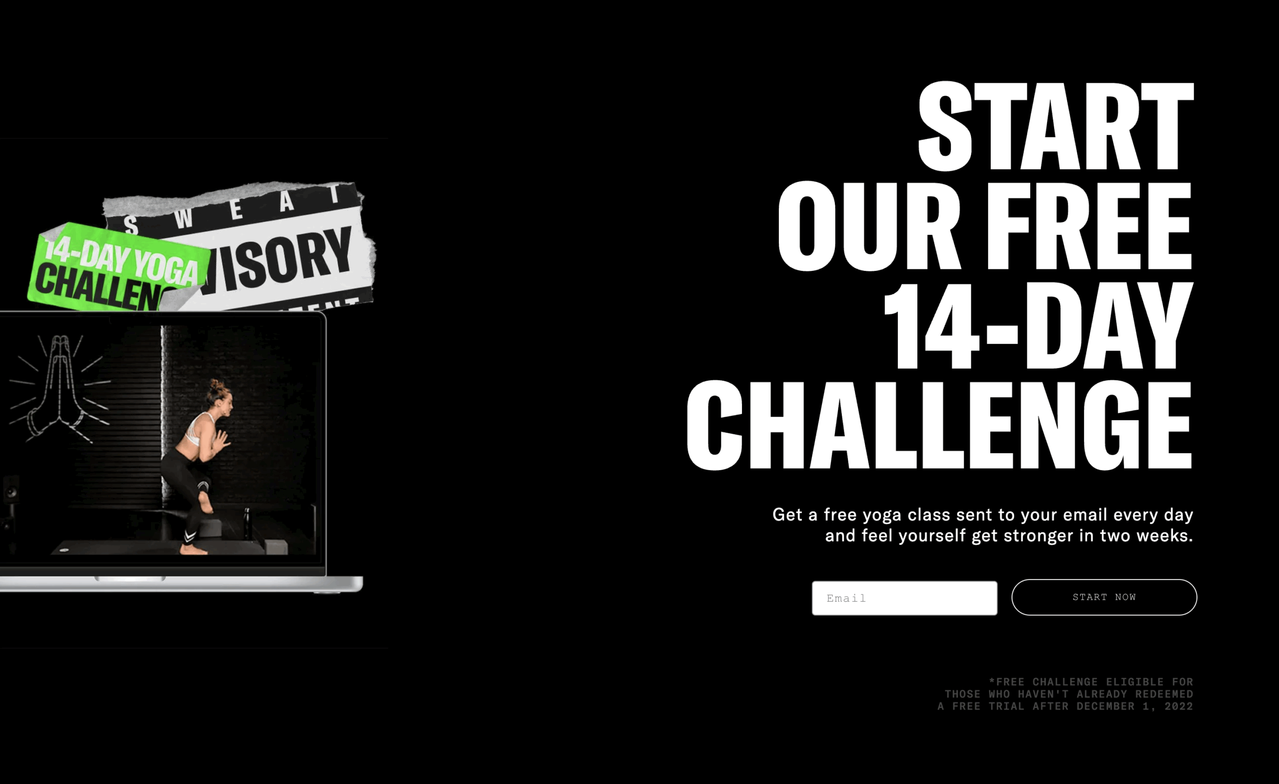
To promote our redesigned product, I had to develop a consistent visual and verbal identity that resonated with our dual personas: cross-selling studio clients, and attracting at-home yogis.
After brainstorming messaging and conducting user interviews, I landed on the primary tagline "The Internet's Sweatiest Yoga"—paired with vivid, sweat-dripping imagery—to stake a defensible claim in our targeted niche.


A key differentiator to Y7's SVOD offering versus native digital platforms was offering not just yoga, but the experience of a cult brick-and-mortar brand. I emphasized this social proof heavily in product marketing materials, which analytics showed carried more weight than our new music integration (which was viewed as table stakes by users, rather than a point of differentiation).

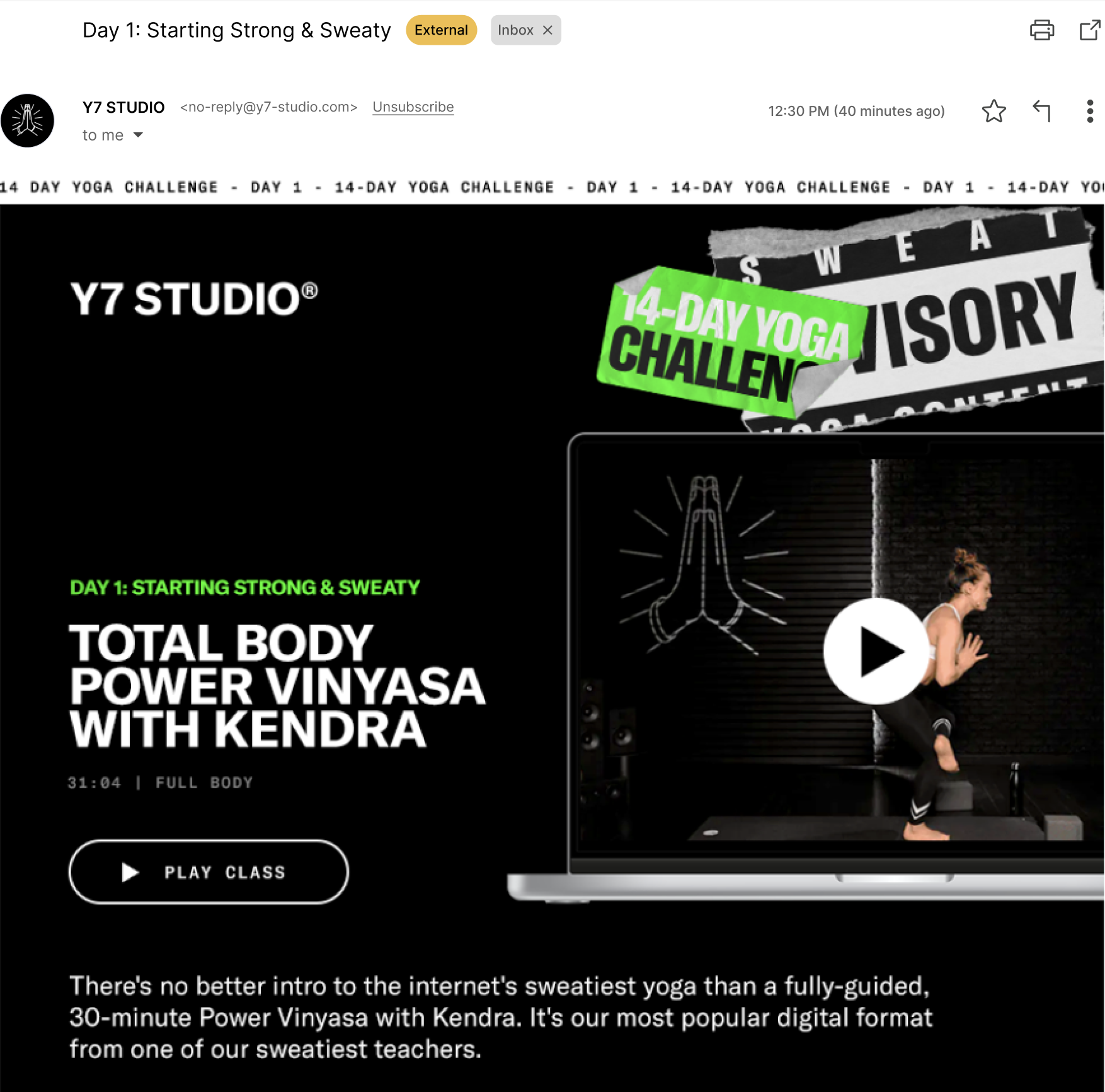
Subscriber Onboarding
One key post-launch content design initiative was the rebranding of our 14-day free trial into a yoga challenge. This attempted to solve for D7/D14 retention and increase free-to-paid conversion rates through dripping a curated content journey, rather than relying on discovery alone. I closely collaborated with our digital programming lead to analyze our best-performing content and curate a comprehensive snapshot of our content for trial users.