
Streamlined class reservation journeys and unified SVOD + studio systems to improve customer experience and unlock cross-channel value.
ROLE
Led End-to-End Product Design
TIME
2021-23
PLATFORMS
Web
SKILLS
UX Research
Information Architecture
Interaction Design
Content Design
UX Writing
Visual Design
Wireframing
Prototyping
TEAM
1 Visual Designer
1 Product Owner
1 Technical Lead
4 Full-stack SWEs
IMPACT
-60% Avg. Time-to-Reservation
+15pp New Client Offer Uptake
+6pp Membership Starts
+80% SVOD Free Trial Starts
To comply with any non-disclosure agreements, I have omitted, sanitized, and/or obfuscated confidential information in this case study.
All information in this case study is my own and does not necessarily reflect the views of Y7 STUDIO.
Discovery
Context & Design Challenge
When studios reopened, the split between SVOD and studio systems became a major friction point
Meanwhile, the studio booking experience remained outdated, slow, and confusing—adding friction to one of the brand’s most critical customer touchpoints. The legacy digital platform for studios was riddled with friction. Journey mapping and analytics showed it could take up to seven pages and 40+ clicks to reserve a single class. Along the way, clients often abandoned the process or missed offers they were eligible for—hurting both satisfaction and revenue.
The pandemic had proven the strategic value of digital, and Y7 saw a chance to reimagine its platforms for an omnichannel future—one where studio clients could effortlessly reserve in-studio classes while finding digital value between visits, and SVOD could compete head-to-head with category leaders. Achieving this meant unifying two disjointed, off-the-shelf systems into a seamless, custom-built product.
Streamlining Class
Reservation Flow
The priority was to make booking feel more intuitive, less frustrating and dramatically reduce time-to-reservation.
IxD Ideation + Wireframing
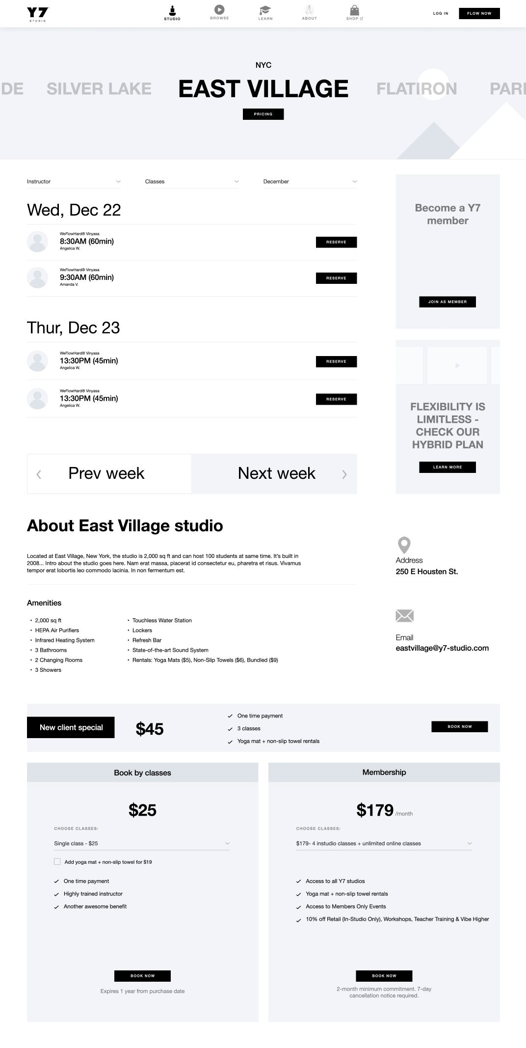
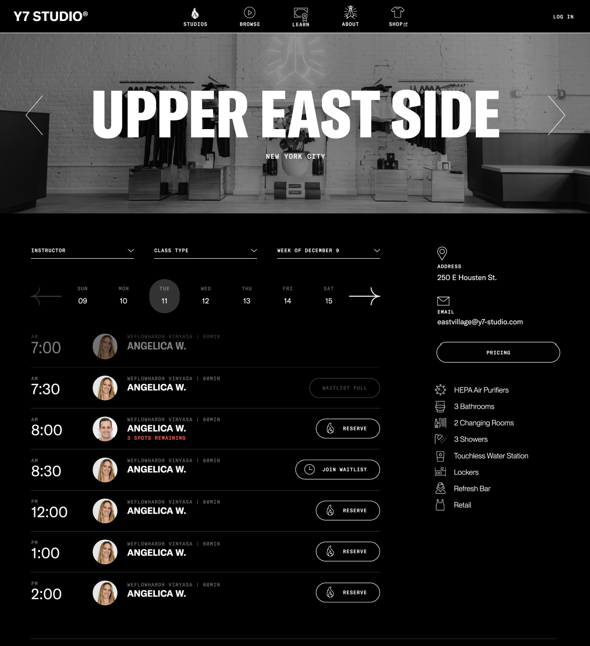
I consolidated three separate sub-pages for each studio (Info, Pricing, Schedule) into a single page accessible from the homepage in one click.
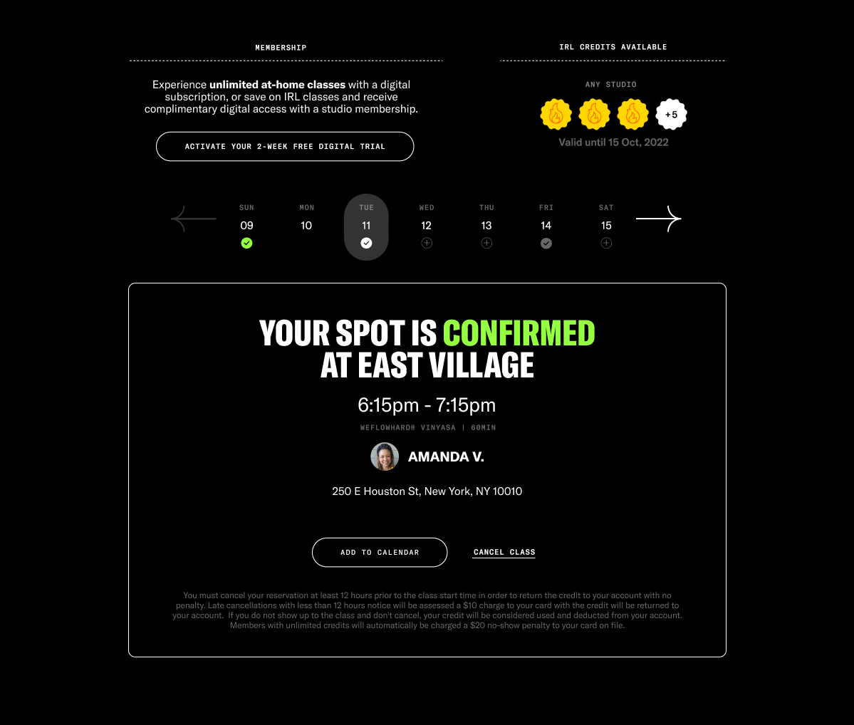
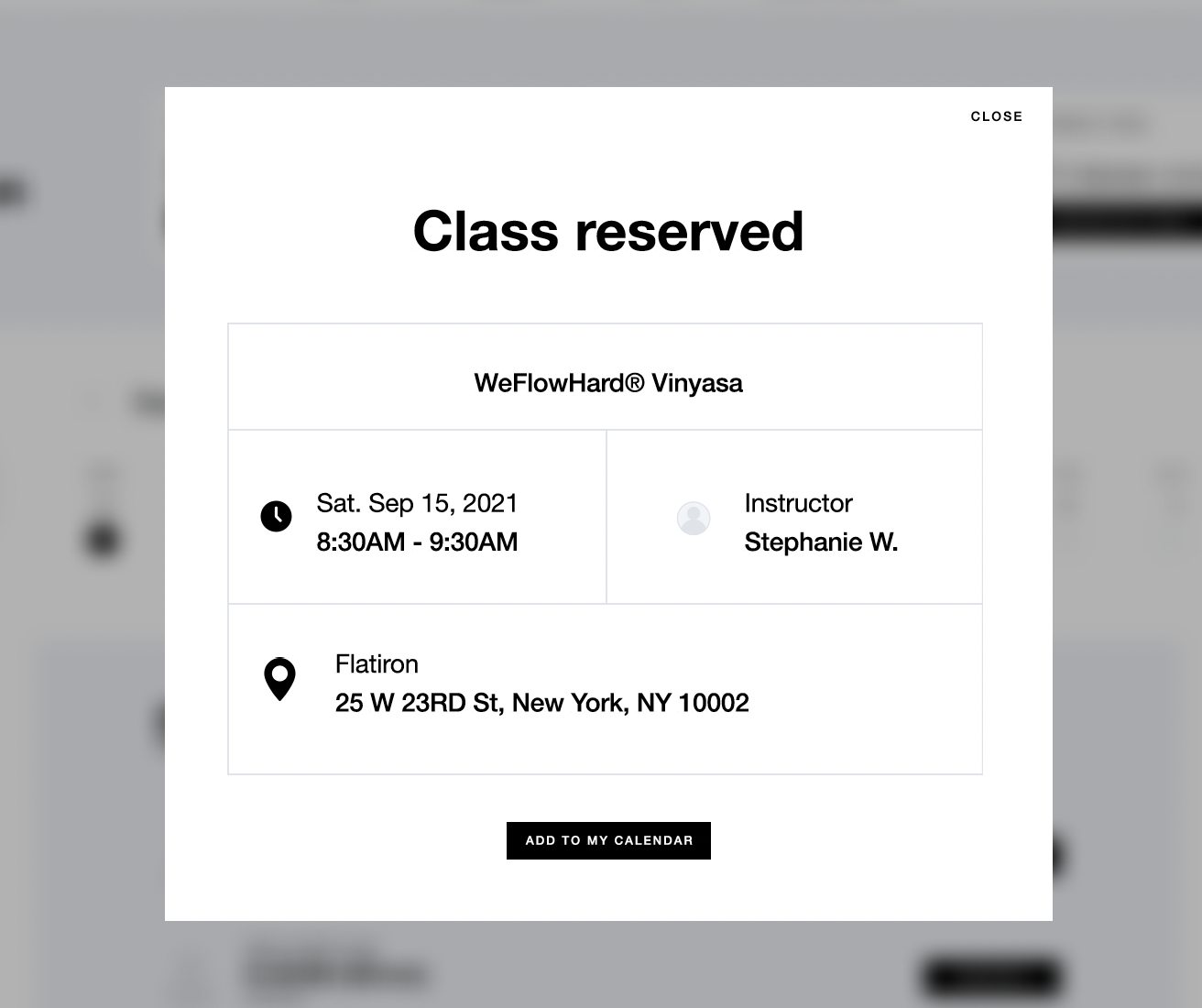
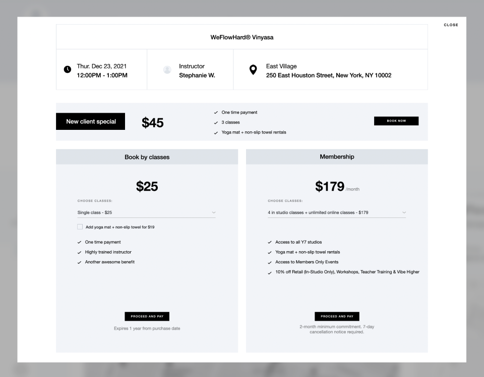
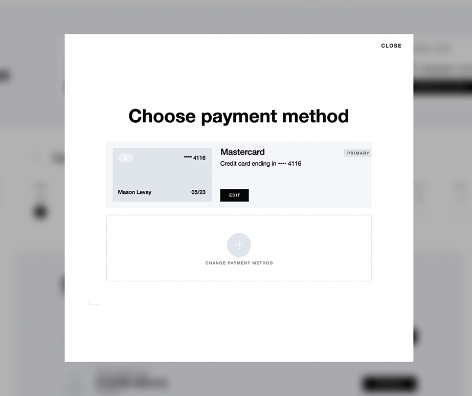
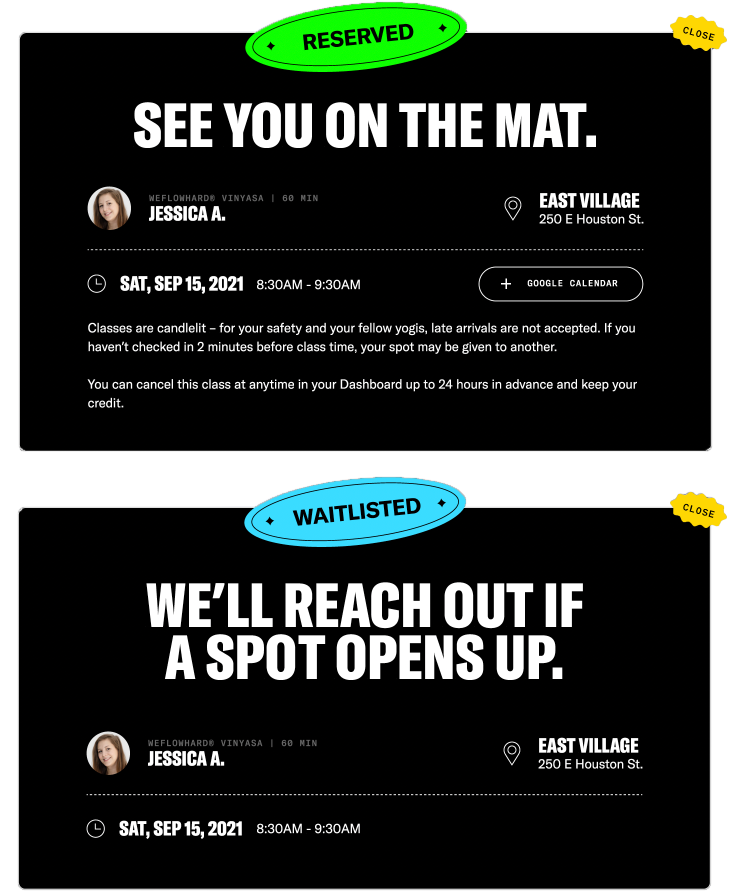
When attempting to reserve a class with an active membership or credits, a modal confirmed the reservation instantly. If not, the full credit/membership purchase flow now also stayed on the page—contained in a modal—to reduce friction.
Interaction Refinements
To prevent the page from requiring excessive scrolling, I added a date picker to limit the number of visible classes and moved studio information into a right sidebar.
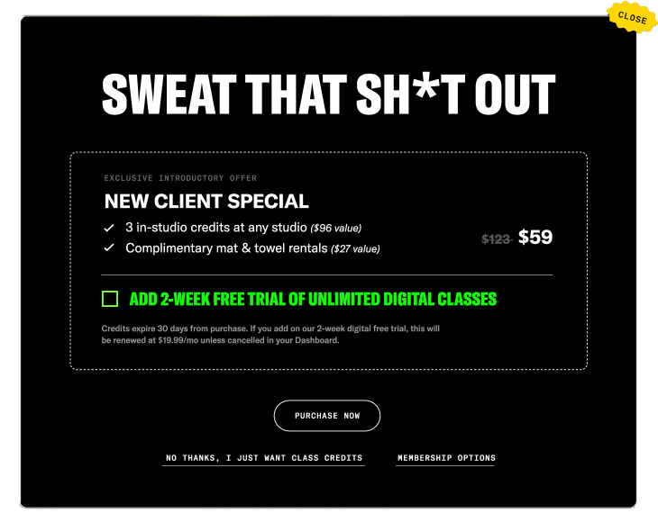
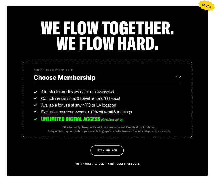
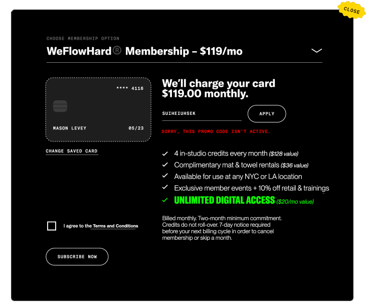
I refined modal logic to align with business priorities, which significantly boosted recurring revenue. Rather than offering all three pricing options at once, the following logic was put into place:
New clients saw an intro offer first.
Returning clients were first prompted to save with a recurring membership.
In all cases, a one-click fallback to a fixed-credit option remained.
I paired this logic with content design refinements—sharpening headlines, CTAs, and microcopy to reflect Y7’s brand voice and make upsells feel on-brand, not pushy.
Net result: a fragmented, seven-page journey collapsed into a single, intuitive modal-driven flow—faster for users, with stronger commercial outcomes for the business.
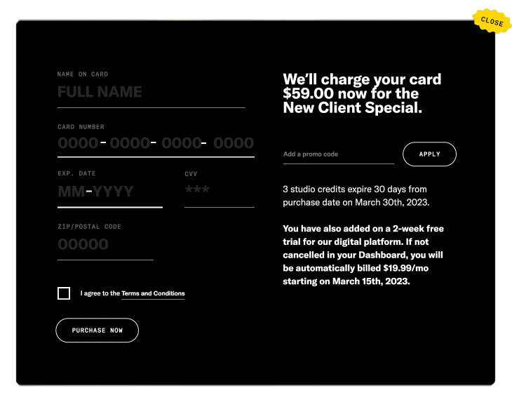
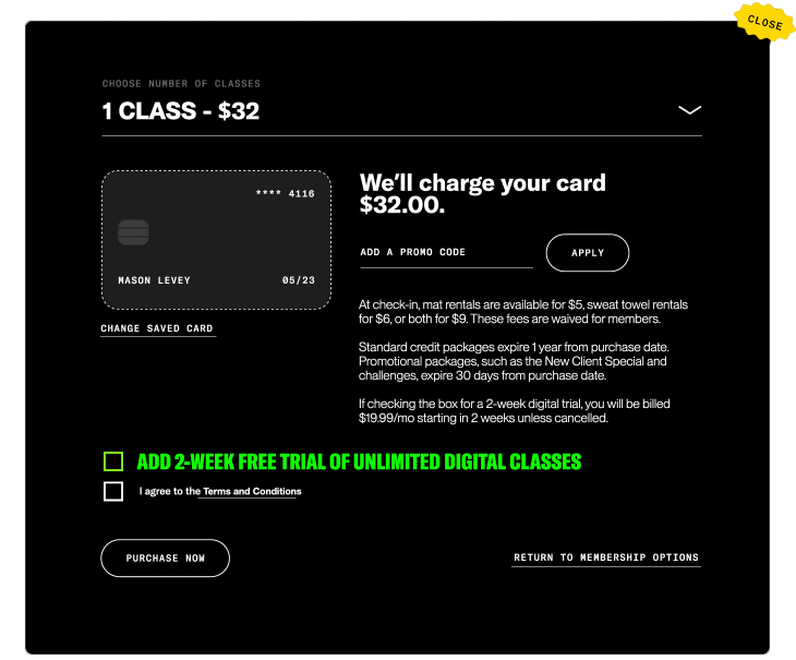
Through adding a simple checkbox to both the new client offer and fixed credit purchase flows, users could seamlessly start an unlimited digital free trial—if eligible—without disrupting their class reservation (memberships now already included this access). This subtle UX change drove a double-digit lift in SVOD trial starts after implementation.
Building an
Omnichannel Dashboard
Ideation & Wireframing
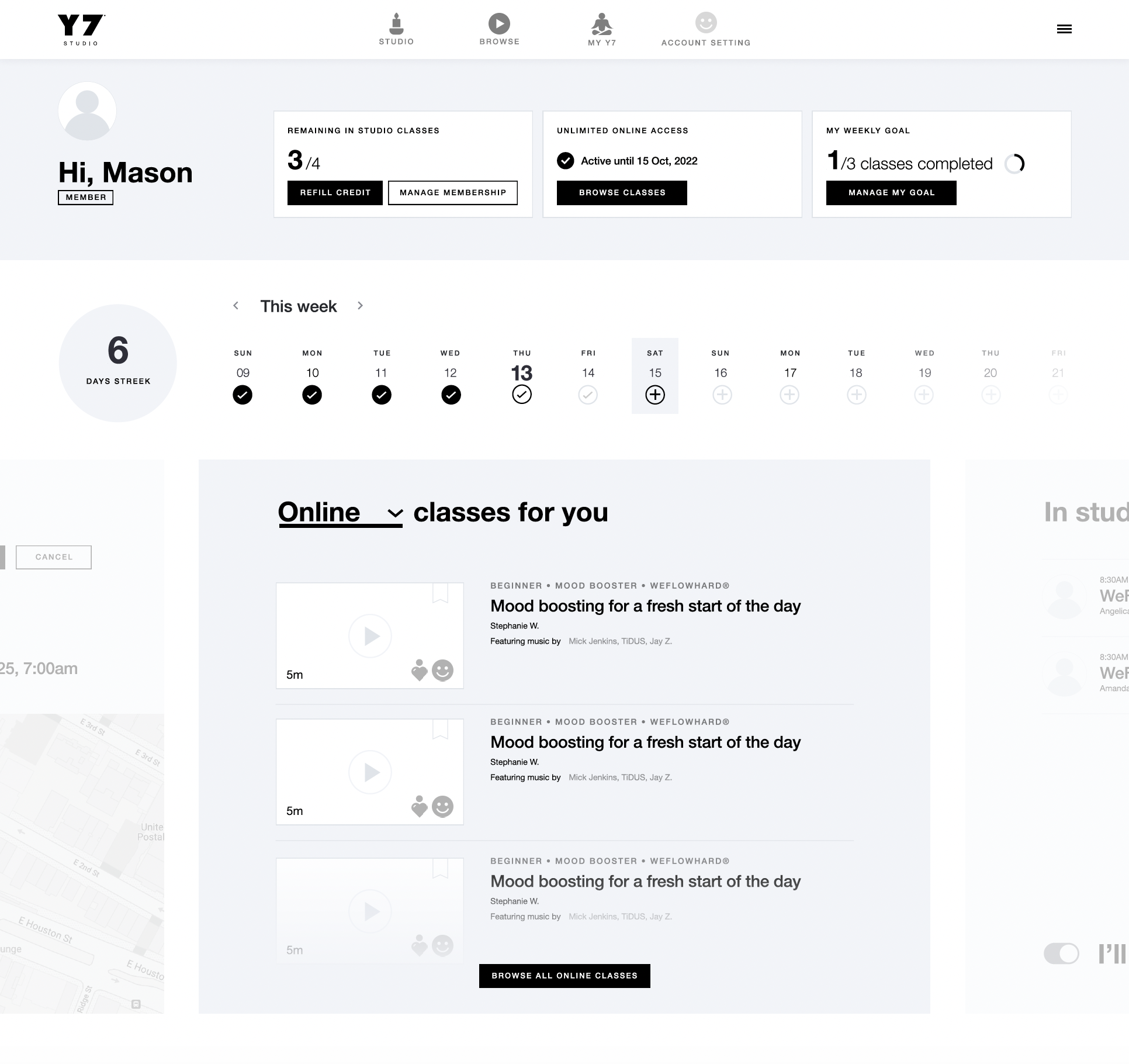
Previously, it was a tedious process for studio clients to view, change, or cancel their upcoming class reservations—mirroring many of the same aforementioned frustrations in reserving a class altogether.
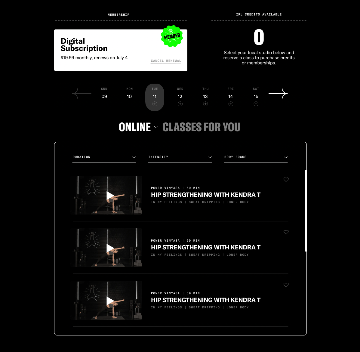
Prior to re-launch, SVOD and brick-and-mortar offerings were separated into distinct platforms. A studio client attempting to try at-home classes would find their existing login didn't work. Digital subscriptions and studio memberships were separate offerings, leading to confusion.
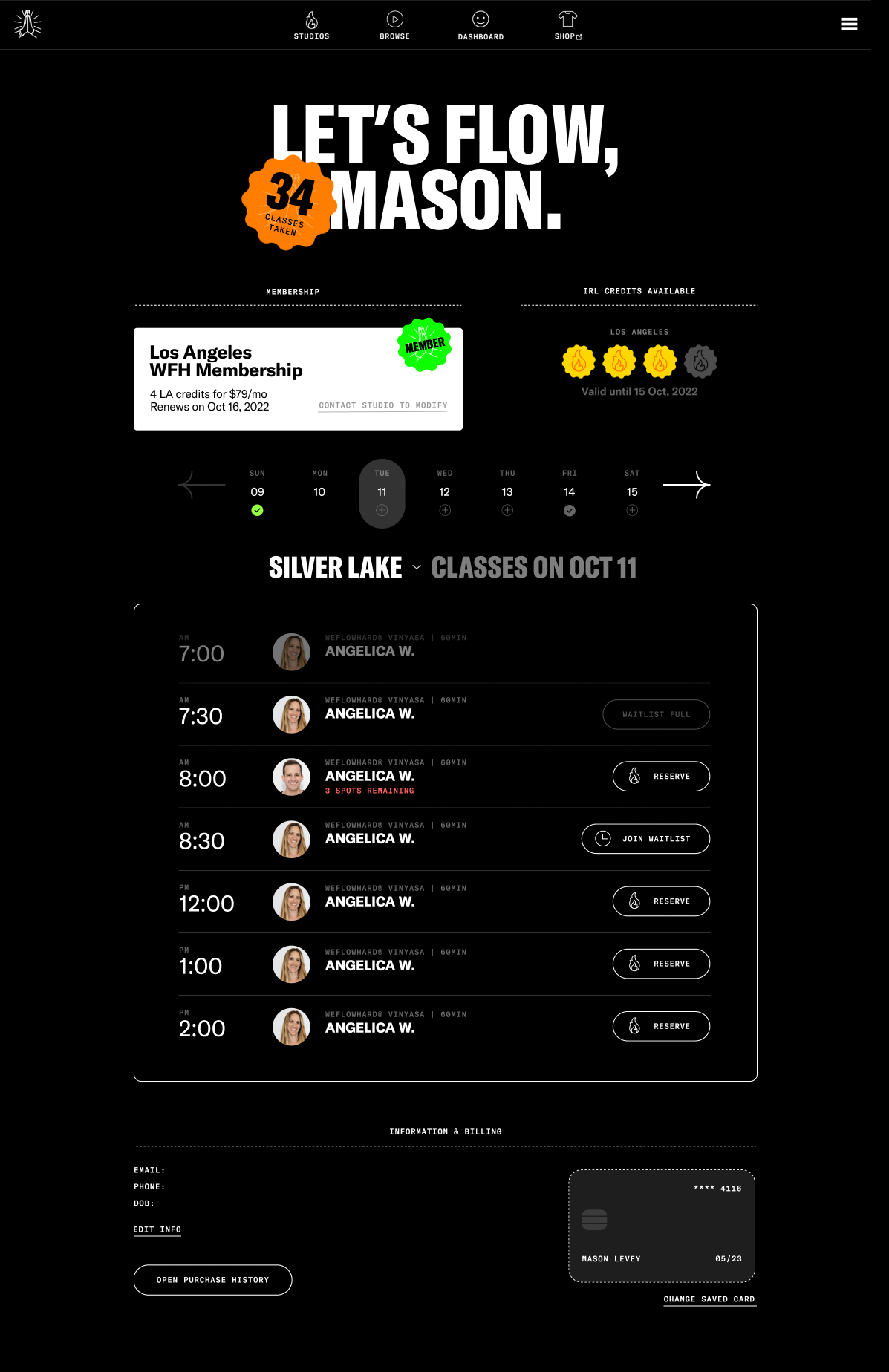
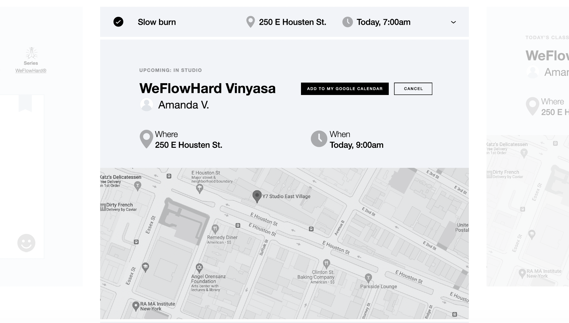
I designed a dashboard—the default landing for authenticated users—where clients could quickly manage upcoming reservations, book a spot at their preferred studio in one or two clicks, or start one of the latest digital classes.
At a glance, they'd also be able to see how many total classes they've taken with the company (both in-studio and digital), their remaining studio credits, and manage their studio membership or digital subscription.
Below, I included a similar date picker interface to the studio page. One notable change
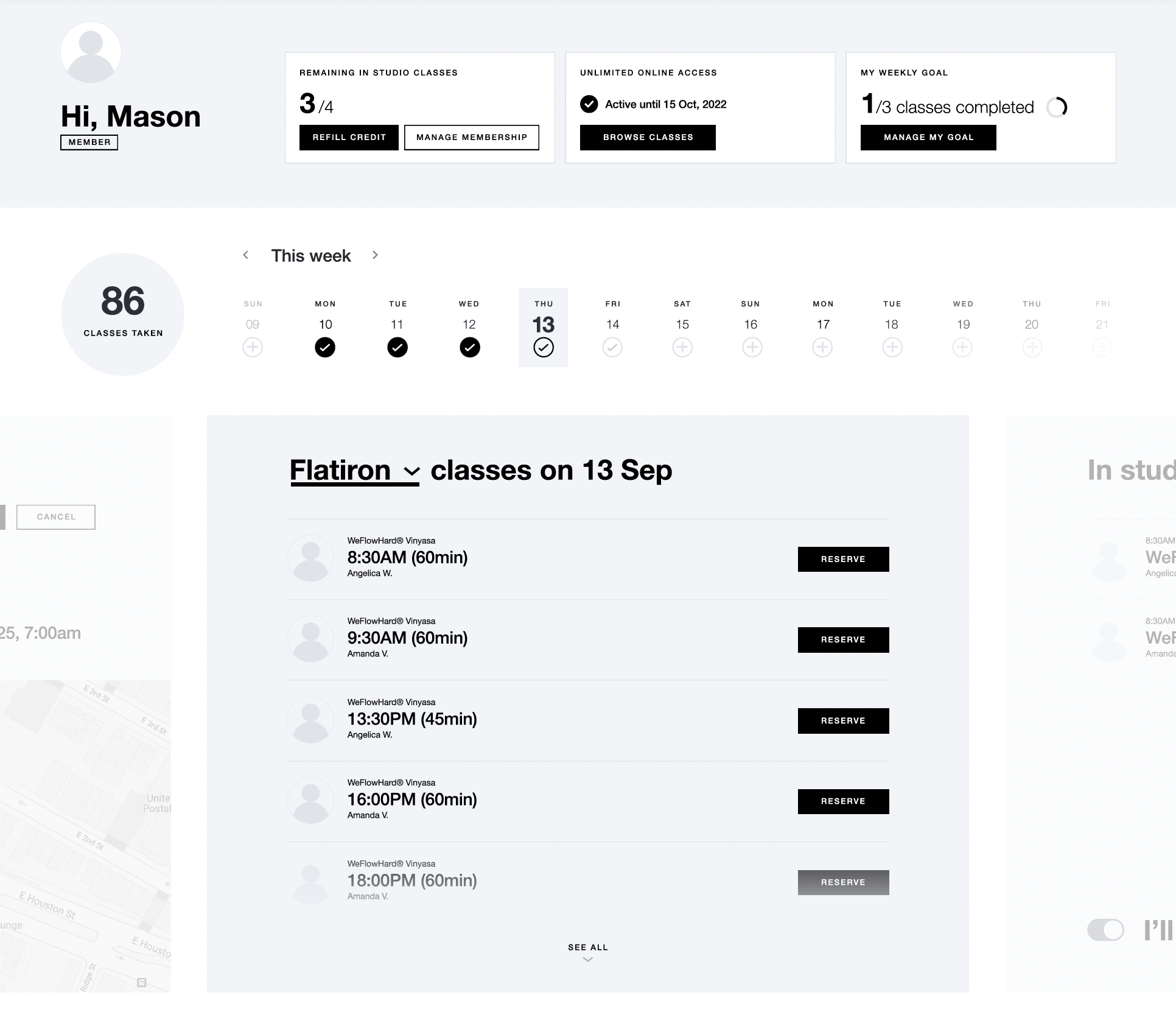
Within both intro and fixed-credit flows, clients could also start an unlimited digital free trial without disrupting the booking—driving a double-digit lift in trial starts after launch.
UI DESIGN