
Designing a next-gen self-discovery experience through gamified journaling and Generative AI.
Role
Co-Founder & Design Lead
Time Period
2023-present
Surfaces
Web, iOS
Design Functions
Information Architecture
Interaction Design
Visual Design
Content Design
Design Systems
Brand Identity Design
Team
1 Technical Co-Founder
Discovery
I approached this project as a target user. Like millions of others, I'm drawn to self-discovery tools like personality tests and astrology apps. But these only scratch the surface, and don't help connect the dots or surface blind spots the way a skilled psychodynamic therapist might. Yet this depth-oriented therapy was inaccessible for most: $400+/hr, out-of-network, and months-long waitlists.
Journaling, by contrast, is one of the most accessible tools for self-discovery. Yet most products fall short. At one end are blank notebooks that demand enormous discipline and leave users staring at an empty page. At the other are gratitude journals and mood trackers, which don’t help uncover deeper patterns of the mind. The hunger is there—over half the population has tried to journal—but the retention is not, with fewer than one in five sticking with it.
This wasn’t my first attempt to bridge that gap. During my MINDSET brain gym venture, I designed a physical journal with curated self-discovery prompts. It was never meant to be core to the business, but quickly became a sleeper hit that sold thousands of copies. Years later, customers still reach out saying it reshaped how they approach life. That experience confirmed something I already believed: with the right scaffolding, reflection can be transformative.
Design Challenge
With the rise of generative AI, I saw the chance to take my earlier success much further. Instead of a static book of prompts, I could design a dynamic, intelligent journal—one that tailors each user’s self-discovery journey to their goals, sparks deeper insights through contextual follow-ups, and surfaces patterns from scattered thoughts.
I wasn’t the only one to recognize AI’s potential in self-reflection, but most new entrants converged on the same formula: LLM-wrappers masquerading as "conversational" journals. This UX pattern might work for some, but the interaction lacked the structure, agency, and progression I valued. With no goals to pursue and no outcomes to reach, they struggled to sustain engagement—offering little more than what I already had in ChatGPT.
With AI commoditized, this was fundamentally a UX challenge: to create a dynamic journal that gamified self-discovery through structured progression that balanced guidance with agency. The goal: making breakthroughs accessible to anyone who puts in the work.
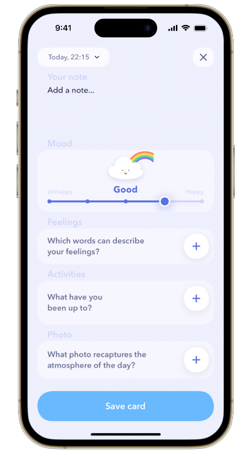
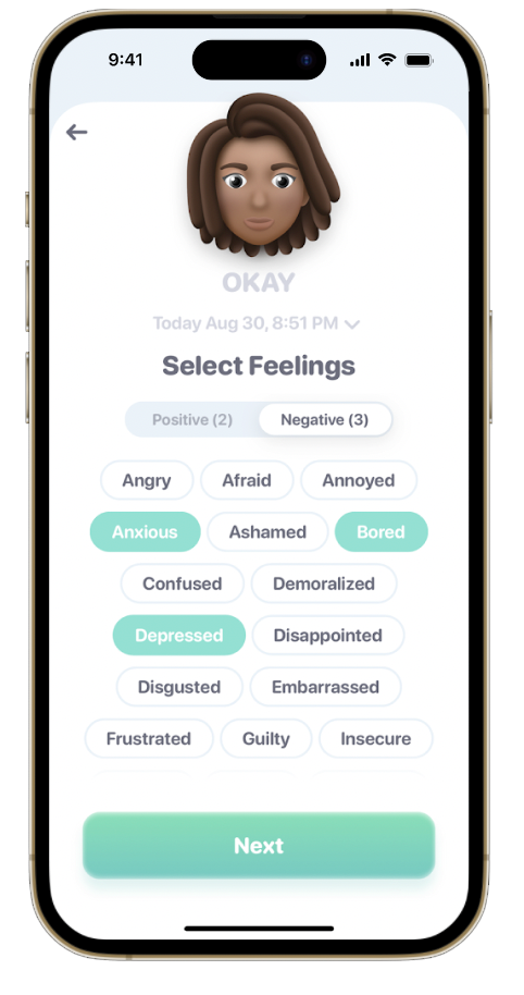
The majority of "pre-AI" journal apps both felt shallow in depth and infantile in design.
Target Persona
The Self-Discovery Junkie
Curious, introspective millennials and Gen Z in their 20s–30s. Psychology nerds at heart, they love tools that help them decode themselves: psychodynamic therapy (if only they could afford it), personality tests, Co–Star, and journaling prompts. Digital natives and comfortable with AI, they expect products to be intelligent, credible, and beautifully designed.
How They Process the World + Design Implications
-
Curiosity-Driven: Hungry for new perspectives and connections. Design for novelty and unexpected links between entries.
-
Pattern-Seeking: Seeks reflections that uncover a bigger truth. Design for progression and synthesis that reveal arcs over time.
-
Authenticity-Driven: Anchored in personal values; reflection must feel authentic—not prescribed. Design for a personalized voice.
Pain Points
Blank pages are paralyzing. Open-ended journals demand discipline most users can’t sustain, leading to abandonment or aimless reflection.
Insights get lost. Past reflections sit scattered across notes apps, never resurfacing when they’d be most valuable.
No real breakthroughs. Existing tools rarely lead to the “a-ha!” insights users crave, making reflection feel like busywork.
AI chatbots remove agency. Conversational journals collapse into banter, offering no sense of structure or progression.
Therapy is out of reach. They crave the depth of psychodynamic therapy but can’t access it—too costly, slow, or inaccessible.
Apps feel patronizing. Childish or simplistic interfaces feel infantile to users who expect Co–Star-level polish and crave authenticity.
Jobs-to-be-Done Framework
- When I'm trying to make sense of myself, I want a structured path for self-discovery, so it gives me an encouraging sense of achievement.
- When I’m exploring my thoughts, I want tailored follow-up prompts that push me deeper and not just skim the surface.
-
When I finish reflecting, I want an analysis that highlights my distortions and challenges my perspective, so I leave with insights I can act on.
- When I’m facing a challenge, I want structured guidance personalized to my unique context, so I can work through it in an actionable way.
- When I start and/or end my day, I want lightweight but meaningful prompts of my choosing, so I can turn them into a grounding ritual.
- When I close out a week, month, or year, I want a way to capture my key lessons and memories, so I can track my growth over time.
-
When I look back over my journal, I want recurring through-lines and themes highlighted, so I can recognize the hidden patterns shaping my life.
Guiding Principles
To solve this design challenge, I defined a set of guiding principles anchored in the key tensions we faced. This framework shaped every design decision.
Keep it fresh and fun.
Continously spark users' curiosity—whether that’s a surprising angle, a new perspective, or connections they hadn’t noticed. The challenge is balancing novelty with consistency: too much sameness feels stale, too much variation feels chaotic.
AI is a copilot, not in the driver's seat.
AI adds value by synthesizing, reframing, and connecting the dots between entries—becoming the “intelligent therapist’s assistant” many users can’t access otherwise. But it must never feel like the machine is speaking over them. The AI should guide, not dominate: a copilot that surfaces insight while keeping the user firmly in control of their own narrative.
One size doesn't fit all.
Reflections must feel personal—grounded in the user’s own words and values. At the same time, journaling needs flexible entry points: some days users want a deep dive, other days just a quick note or voice memo. The system should effortlessly adapt.
Prioritize depth, not streaks.
Many journaling apps lean on gamified streaks and habit tracking. That works for productivity tools, but here it cheapens the experience. Users want to feel they’re having meaningful breakthroughs, not checking boxes. Progress should be framed as growth, integration, and insight.
Information Architecture
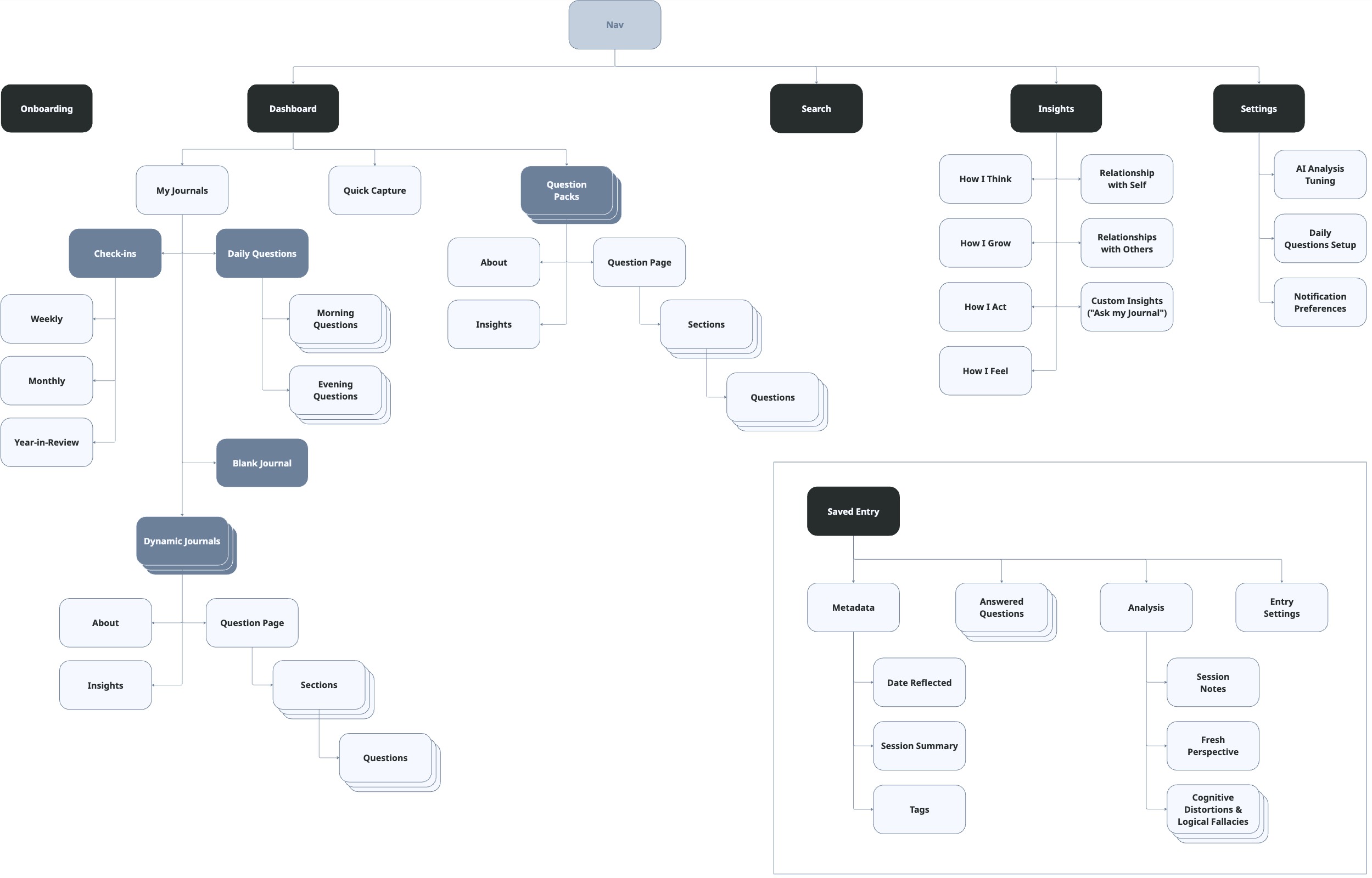
As an end-to-end self-discovery platform that accommodates a variety of different journaling styles and intents, well-defined information architecture was crucial to mark clear distinctions.
As an end-to-end self-discovery platform that would accommodate a variety of different journaling styles and intents, clear information architecture to mark clear distinctions between features. Applying the Principle of Choices, I broke journals into clear subtypes that better highlight the subtle feature differences between them.
Question Packs: Our core IP: thematic self-discovery journeys of curated static prompts (e.g. Core Values, Self-Concept). Extensible by a future marketplace model with partner-authored packs.
Custom Journals: Adaptive reflection frameworks for specific challenges or “self-therapy” topics. These personalize a pre-defined scaffold to the user’s context, or generate a new one entirely if no template exists.
Check-ins: Structured recaps (weekly, monthly, yearly) that make diary-style reflection more intentional and actionable, capturing memories and lessons at regular intervals.
Blank Journal: A catch-all for freeform reflection, still paired with AI follow-ups and analysis to maintain continuity across modes.
Daily Questions: Lightweight AM/PM rituals of customizable recurring prompts. These don’t trigger the full reflective loop, but still factor into insights.
This avoided collapsing everything into one “journal” category, giving users clarity of entry while ensuring scalable extensibility within existing subtypes and potential new subtypes in the future.
On a high-level, I organized the platform into two core experiences: dashboard and insights. Through the dashboard, users could jump into a journal or quick capture an entry. Insights
The next challenge was defining the structure for AI-generated analysis of reflections. Without structure, the non-deterministic nature of LLMs meant we'd have no consistent structure to analyze.
I also wanted to ensure users could effectively think about their own psychology in easily digestible buckets.
Interaction Design
The core challenge was designing a journaling experience structured enough to be habit-forming and engaging, yet flexible enough to adapt to different needs and styles.
I set out to design something different: a structured path to self-knowledge, built around distinct journaling modes that yield repeatable insights. The interaction design had to make reflection approachable in the moment while scaffolding it into a long-term practice. Most journaling apps focus on a single journaling style: open-ended blank notebooks, habitual recurring prompts, or collections of guided prompts.
To keep users engaged, I layered in gamification through discovery, progression, and cadence. Packs became journeys, with visible progression through finite sets of prompts that closed with a sense of achievement. Adaptive follow-ups unfolded like quests, revealing new prompts in response to each reflection and turning journaling into an exploratory dialogue. Regular prompts reinforced rhythm — subtle streaks and milestones gave users the satisfaction of consistency without breaking the reflective tone.
Dashboard
Most journaling apps open to a feed of entries or a single prompt of the day. That approach blurs intent: am I writing a diary entry, answering a guided question, or just jotting down my thoughts?
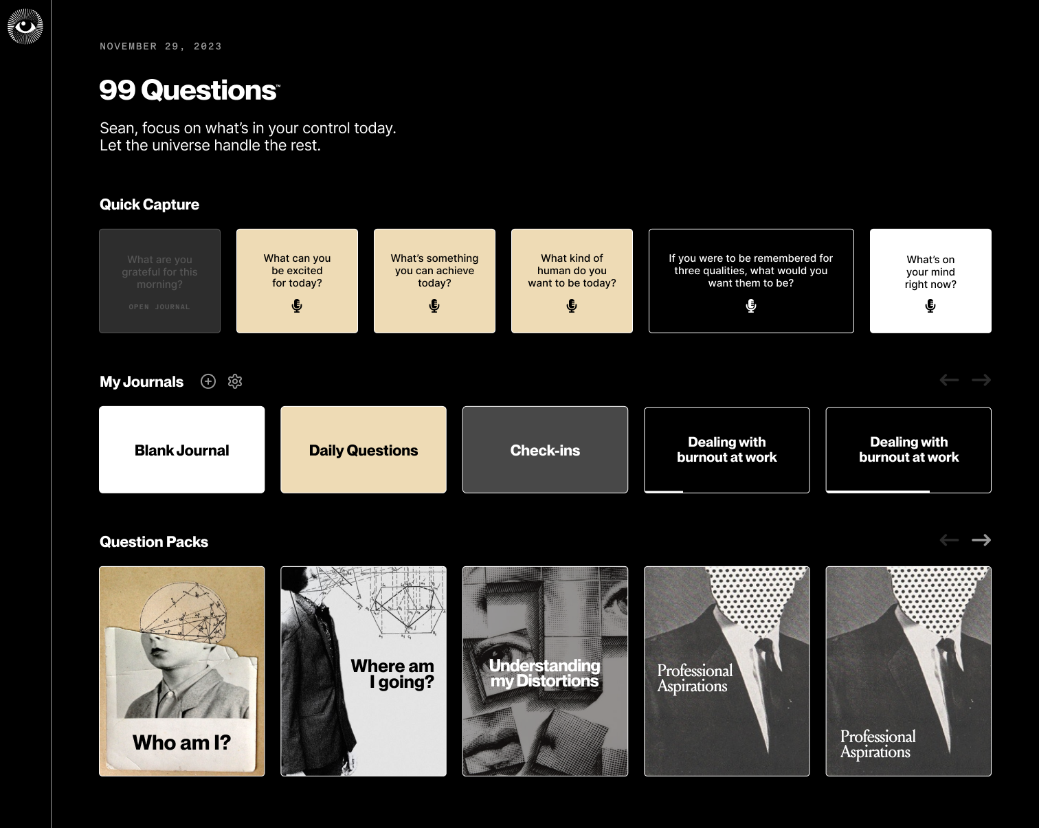
I wanted the dashboard to act as a hub, not a feed—an end-to-end self-knowledge platform where users could choose the kind of reflection they needed in the moment.
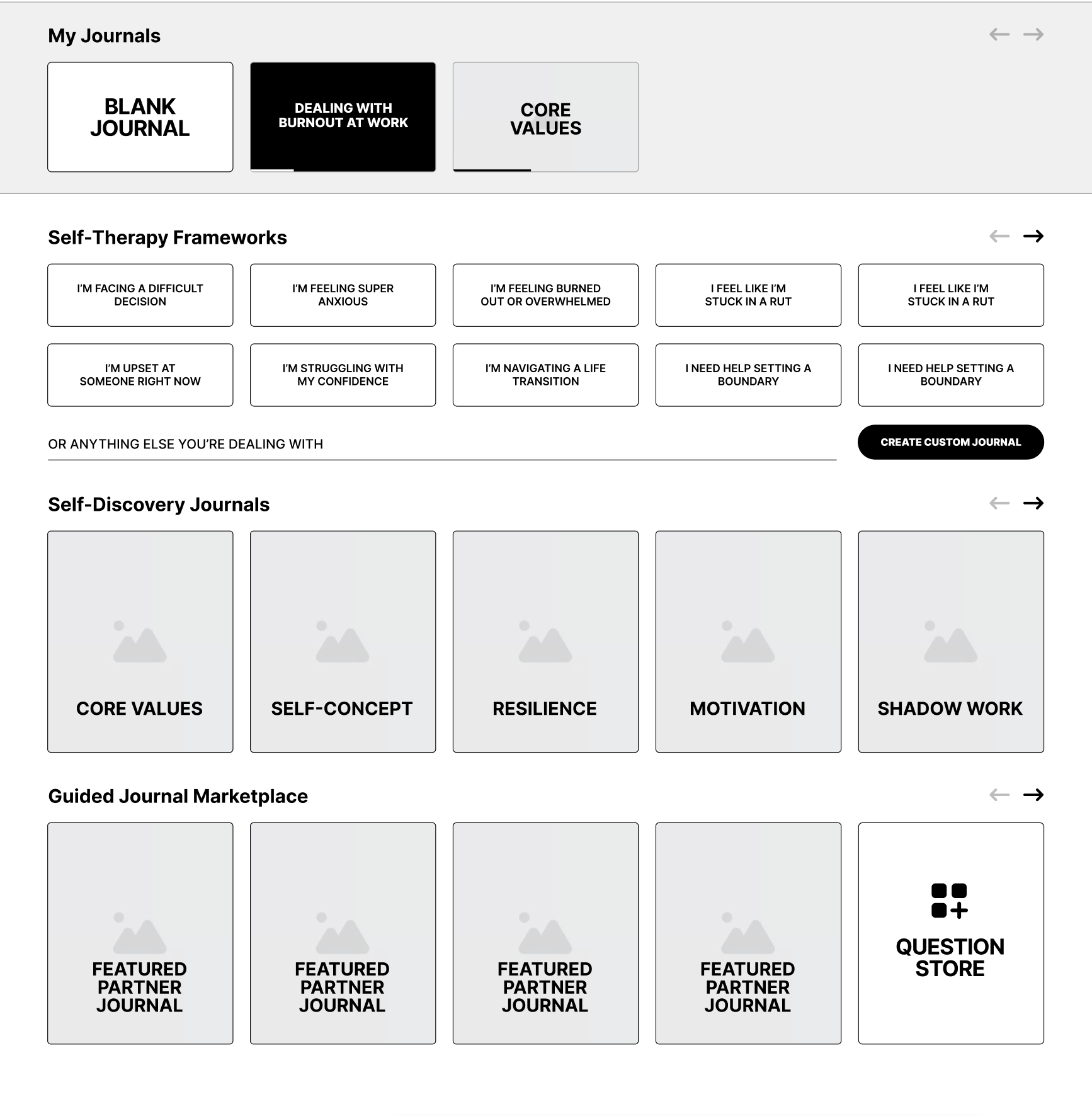
Early Dashboard wireframes
A custom neon sign framed above a lounge couch, designed as a viral Instagram moment to turn guests into informal brand advocates.
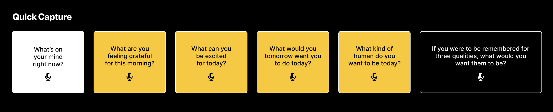
Quick Capture
At the top, this row gave users a low-friction entry point to get started. They could answer their daily questions, tackle a random self-discovery question, or ensure spontaneous thoughts for their blank journal weren't lost.
Rather than the click jumping into a separate journaling interface, these were mic buttons to record voice to minimize friction. For daily questions, they could be quickly answered without leaving the dashboard, while the random self-discovery question or blank journal entry would lead into the reflective loop upon completion.
My Journals
Below the Quick Capture row, My Journals offered a one-click, above-the-fold entry point into a user's catch-all blank journal, daily questions,

Question Packs
At the bottom, Question Packs invited users into curated self-discovery journeys. The card design emphasized that these were finite, targeted explorations with a beginning, middle, and end rather than an endless stream of prompts. Packs gave journaling its game-like progression: completing levels, advancing through themes, and unlocking structured insights.
The dashboard wasn’t just navigation; it was a mental model for the product. Quick Capture made journaling approachable. My Journals gave continuity and habit scaffolding. Question Packs offered depth and long-term progression.
Together, they framed journaling as a system with multiple doors, each leading back into the same reflective loop. This solved a core usability issue: clarity of intent. Users never wondered “where do I write?” — the dashboard told them how they could reflect, and why it mattered.
Question Cards
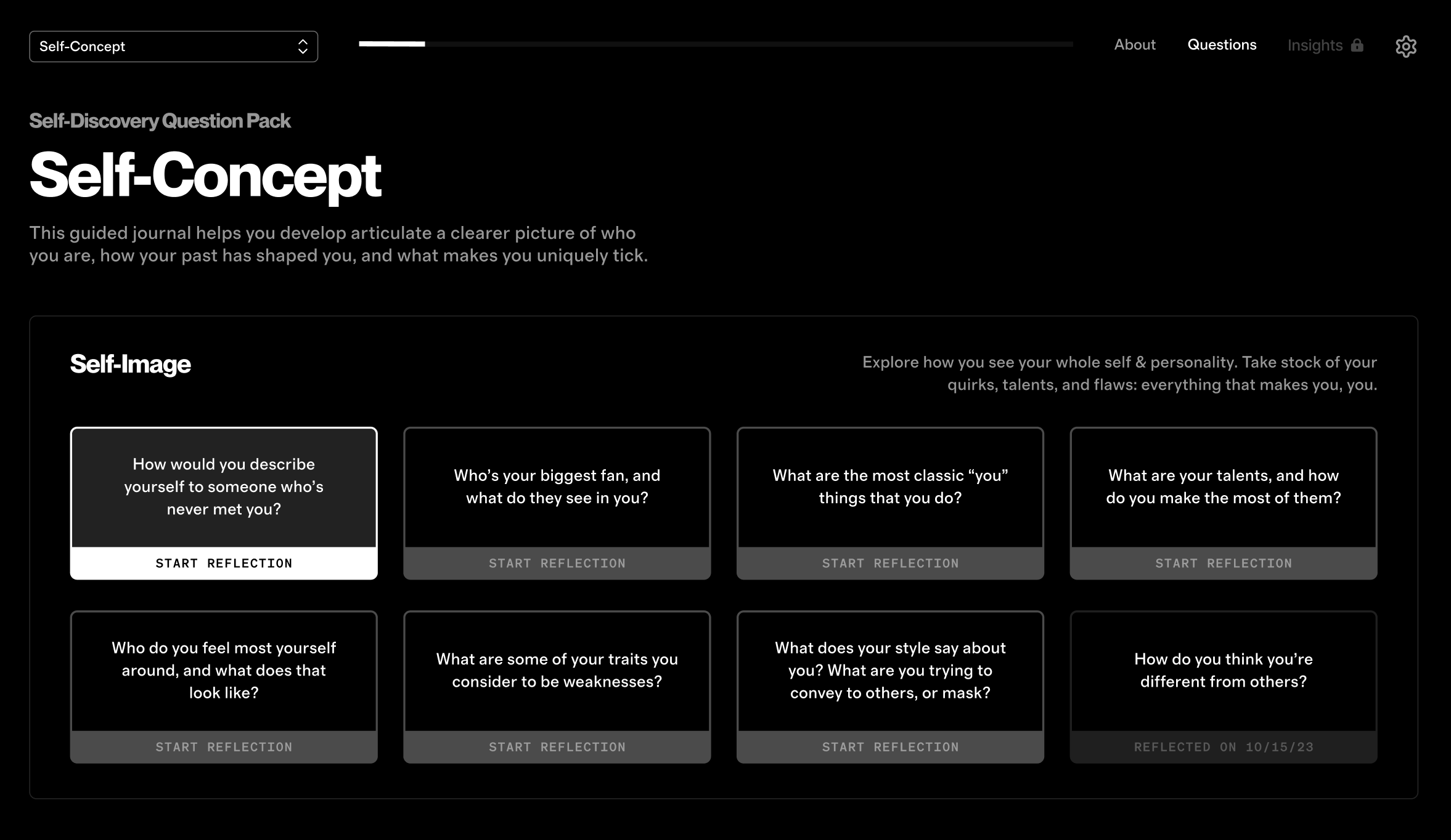
For guided, question-based journals (curated packs + dynamic journals), I treated each question as a card to make abstract self-discovery feel like a structured journey. This accomplished a few goals:
Agency
Unlike conversational journals that dripped out questions one by one, the card design let users see the path ahead and choose their entry point. Reflection became something they could actively navigate, not just passively consume.
Progression
Cards were grouped into digestible sub-themes, turning abstract reflection into a journey with clear stages rather than dumping a list with no hierarchy. Users advanced step by step, unlocking increasingly challenging prompts. This provided a sense of momentum and closure, avoiding the aimlessness of infinite prompts.
Trackability
Each card doubled as a progress marker. Strategically, this reinforced momentum, clearly marking which questions have been answered. Functionally, it also made past insights easy to revisit than scrolling through endless past entries.
Reflective Loop
In the guided packs, I treated each question as a card rather than just a line of text. This wasn’t cosmetic—it was about making abstract self-discovery feel like a structured journey.
Conversation Design
In the guided packs, I treated each question as a card rather than just a line of text. This wasn’t cosmetic—it was about making abstract self-discovery feel like a structured journey.
Optimizing Membership Structure
Service Blueprint + Journey Mapping
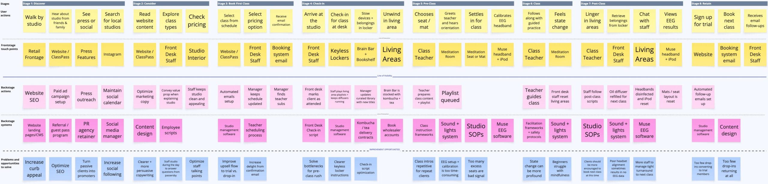
Designing the studio was as much about backstage choreography as frontstage experience. Every client interaction—from booking a class to sipping kombucha at the Brain Bar—had to feel frictionless, premium, and intentional. To achieve that, I mapped a service blueprint that aligned the guest journey with the operational flow behind it.
Discovery + Consideration
Clients primarily discovered us digitally—through search, press features, social, or ClassPass—where content design established credibility and website flows were crafted to turn curiosity into reservations. Ongoing efforts here focused on optimizing that funnel.
At street level, I aimed to take full advantage of our prominent Yorkville frontage and double it as a daytime touchpoint: staffed as a self-development bookstore, it gave us the chance to answer questions, offer tours, and convert casual passersby into curious prospects.
Check-in + Pre-Class
Front desk staff managed check-in directly, deliberately avoiding self check-in to encourage warmer, more personal interactions. A short onboarding script invited clients to make themselves at home in the living spaces, enjoy the amenities, and stow devices in secure keyless lockers with built-in charging.
One of the trickier design tensions surfaced here: late arrivals. For obvious reasons, they couldn’t enter and disrupt the meditation. On paper, our policy was strict: late arrivals forfeited their credit. In practice, we erred on the side of grace, re-scheduling occasional offenders into the next available class or returning their credit. This balance protected the integrity of the class experience while maintaining goodwill.
Class + Post-Class
Inside the meditation room, instructors guided sessions using structured frameworks that balanced consistency with variety. For EEG classes, they also assisted with headset setup and calibration—which could be cumbersome, and one of the few areas that needed post-launch optimization. Backstage systems managed lighting, scent, and sound cues in sequence, while front desk staff outside quietly reset living spaces and amenities for the next cohort.
After class, clients returned to the living spaces where they were encouraged to linger. Eventually, I instructed teachers and staff to engage with clients through subtle but structured upsell scripts—explaining the benefits of trials and memberships, and offering to book their next class in-studio to reduce friction.
Problem
Early retention struggles revealed that the boutique fitness model didn’t map cleanly onto meditation. Drop-in classes weren’t as sticky as hoped and, while a paid 14-day unlimited trial was popular, only 4% converted into an unlimited membership. For time-poor professionals, attending 10+ times a month was unrealistic. And without a recurring revenue base of members to foster community, the business was trapped in an unsustainable cycle of acquisition and churn.
Service Response & Impact
This not only created a premium revenue stream but also a sticky on-ramp into membership. While courses weren’t recurring revenue in themselves, graduates converted into members at rates comparable to trials—but with far higher upfront value and deeper community integration.
Problem
To grow awareness, we offered complimentary lunch & learns at nearby offices. HR leaders eagerly booked them, and turnout was among the highest they’d seen for internal programming. Yet almost none of these employees converted into studio demand. We were presenting directly to our target persona—stressed, high-performing professionals—but failing to get them through the door.
We tested three approaches:
Employer-sponsored Credits: Selling companies bulk class credits for employees saw minimal uptake. It placed the burden on individuals to self-initiate, which rarely happened.
Studio Buyouts: Transformed dead daytime hours into high-margin incremental revenue. Sales-intensive but effective, they boosted utilization and, through allowing employees to trial the immersive experience during work hours, drove more consumer demand than lunch & learns.
In-office Programming: Bringing sessions directly into the workplace proved the strongest fit. We monetized lunch and learns and expanded on these offerings with seminars, executive trainings, and multi-week programs—creating a scalable B2B offering.