I transformed a pandemic-era digital yoga platform through design thinking, product-led growth, and high-impact partnerships.
Company

Role
Director of Product & Operations, Digital
Time Period
2021-23
To comply with any non-disclosure agreements, I have omitted and obfuscated confidential information in this case study. All information in this case study is my own and does not necessarily reflect the views of Y7 STUDIO®.
BACKGROUND
Y7 STUDIO® was long enjoying explosive growth of it's signature brick-and-mortar experience until COVID-19 lockdowns brought the business to a sudden halt.
Forced to make a quick pivot to digital (without a digital team), the company rapidly deployed an out-of-the-box SVOD platform with Vimeo as a short-term solution to keep its loyal customers engaged with the brand, generating a revenue stream that kept the company afloat during prolonged closures.
PROBLEM
Fifteen months later, digital revenues began to plummet as studios re-opened. Subscribers were churning, and the platform struggled to convert trials and keep users engaged. It no longer had a value proposition in a post-lockdown world.
OPPORTUNITY
Despite the decline, leadership believed in the potential of an omnichannel strategy. Digital fitness platforms were still thriving, and they were committed to investing in a competitive long-term product.
MY Mandate
I was brought on as a generalist "intrapreneur" to lead this transformation, responsible for business strategy, product management, design, partnerships, content operations, and GTM. My key responsibilities included:
- Deploying design thinking to develop a product-led growth strategy
- Designing a competitive UX/UI that improved discoverability
- Managing a cross-functional development team to re-build product
- Pitching, negotiating, and closing key music partnerships
- Re-working content production processes to scale output
- Spearheading go-to-market and growth strategies
IMPACT
Our late 2022 launch was well-received by users and garnered favorable press coverage. Net subscriber decline was immediately reversed through meaningful increases to DAUs, subscriber retention, and trial conversion. I scaled content production 15x—producing 400+ high-quality evergreen classes in 6 months—and secured a landmark music partnership with the world's largest label group.
For the first phase of my design thinking process—empathizing with users—I developed surveys for churned and current subscribers, as well as analyzed existing data sets (e.g. cohort retention, product analytics, cancellation reasons). The results of this analysis confirmed my initial hypothesis: the platform didn't have a sustainable value proposition for its existing "lockdown" customer base, nor was it competitive enough to convert new at-home fitness users.
Cannibalization
DROVE HIGH CHURN
A significant portion of our existing digital subscribers were brick-and-mortar clients who had signed up during the lockdowns. With studios reopening, these users were churning at a high rate. While the platform had value to them during lockdowns, they could no longer justify the monthly subscription once our in-person classes became available again—their preferred way to experience Y7.
LACKING CONTENT + FEATURES
DIDN'T WIN OVER NEW USERS
The most frequent complaints amongst trial users who failed to convert focused on the limited class library and the slow pace of new content uploads, particularly when compared to more affordable, larger competitors like Peloton. These users also expressed frustration with the lack of content discovery features, such as filtering by class type or duration, and were disappointed by our music setup, which paled in comparison to platforms with seamless audio integration.
SUPERIOR YOGA INSTRUCTION
WAS OUR COMPETITIVE EDGE
Active subscribers praised the quality of Y7’s yoga instruction, crediting our talented and relatable teachers who delivered challenging and creative vinyasa flows. Experienced yogis noted that most online vinyasa content from competitors was too easy for them. Despite frustration with the limited content and slow publishing cadence, they still preferred Y7's classes over other platforms, presenting an opportunity to focus on this segment moving forward.
As a key part of my larger UX research process, I sought out to better understand what we were up against. The pandemic rapidly accelerated digital fitness, with industry revenues surging 66% between 2020 and 2021. This attracted significant investment to the space – with the dominant players leveraging vast financial resources to offer low prices while investing heavily in their product.
I honed in on two major classes of competitor: large, generalist fitness platforms (e.g. Peloton, Apple Fitness+, Obé), and yoga-centric platforms (e.g. Glo, Alo Moves). Based on insights from user research, I identified four critical product attributes to assess:
Catalog Size +
Discoverability
A key advantage of major competitors was their content libraries consisting of thousands of classes. Paired with intuitive UX/UI that enhanced discoverability, these platforms allowed users to easily filter by class length, body focus, music genre, and intensity—helping them find the ideal workout amidst vast options.
As one online reviewer worded it, "there are literally thousands of [yoga] classes. It’s basically like if someone recorded every single class in your local studio, and uploaded them. It sounds a bit overwhelming, but, the Peloton app makes it easy to sift through them to find the exact one you’re in the mood for."

Obé boasted a content library of 4000+ classes across 20+ modalities, but an elegantly simple browse page made it easy for users to filter for their "perfect class" based on aspects like the amount of time they had to workout, their desired body focus, and/or their favorite instructor(s).
Music
Integration
A major differentiator for large digital platforms was their ability to integrate popular music. While even the smallest brick-and-mortar studios could easily license hit music, digital platforms faced much steeper barriers. Syncing curated music with video content required lengthy rightsholder negotiations and high costs.
Peloton pioneered a revenue-sharing model for digital fitness that unlocked seamless integration of hit music into classes. Several large competitors followed suit. These platforms showcased class playlists ahead of time and offered users the ability to save new tracks they discover to their preferred DSP, and partnered directly with labels to promote new music releases through artist activations.
In contrast, yoga-centric platforms often relied on royalty-free music or randomized radio, making their music experience far less engaging.

Peloton offered the widest selection of hit music across its classes, prominently displaying the playlist ahead of time and offering users the ability to easily save any tracks they discover in-class to their preferred music DSP. They also worked directly with labels to promote new music through exciting artist activations throughout the year.
Yoga POSITIONING + INTENSITY
Generalist fitness platforms positioned yoga as a supplemental practice, focusing on flexibility rather than offering intense, sweat-inducing workouts. Even yoga-specific platforms primarily catered to beginners, offering less challenging content.
This presented a clear opportunity, as my user research indicated that advanced yogis were underserved by these platforms. They were seeking challenging vinyasa flows as their primary workout and were frustrated by the lack of intensity in most digital offerings.
Production Quality + CADENCE
Large platforms invested in purpose-built production studios, ensuring consistently high-quality video and audio across their classes. They also maintained a rapid content production cadence, uploading evergreen content daily and offering multiple live classes each day. These made these platforms highly competitive, keeping users engaged with fresh, professional content on a continuous basis.
Apple's Fitness+ platform featured crisp, "Netflix-quality" 4K workouts filmed in highly-professional studios.
While Vimeo’s out-of-the-box SaaS OTT solution allowed Y7 to quickly pivot to digital in 2020, it wasn’t optimized for fitness, leading to a range of user experience challenges and operational inefficiencies. These issues spanned the entire user journey and often required extra workarounds from the Y7 team.
Log-in / Sign-Up
DISJOINTED AUTHENTICATION
+ SubscriPTION FLOW
Vimeo’s platform made it simple for users to sign up for free trials that converted to paid subscriptions, but it lacked integration with Y7’s brick-and-mortar management system, MindBody. As a result, studio customers were forced to create separate accounts for digital access, leading to confusion, frustration, and unnecessary customer support load.

The online registration flow hosted on Vimeo's platform.

The studio account registration form via MindBody API.
This lack of integration also meant that Y7 couldn’t bundle digital subscriptions with studio memberships or easily upsell digital access to in-person clients, limiting the potential for a seamless omnichannel experience and cross-selling opportunities.
Finding & Selecting Content
LIMITED FILTERING +
CLASS DISCOVERY
Vimeo’s browse functionality wasn't built for fitness platforms with attribute-heavy metadata. They couldn’t filter classes by multiple attributes, such as class type, intensity, or body focus, making content discovery cumbersome. As a result, Y7 had to manually organize videos into curated playlists, often with single attributes like class duration or specific themes such as "self-care."

This playlist-based workaround made it difficult for users to find exactly what they were looking for. Additionally, class metadata was limited to the title, leaving users without key information like intensity level or music vibe until the class had already started.
Playing a Class
MUSIC WORKAROUNDS +
PRODUCTION QUALITY ISSUES
Without a music licensing deal in place, Y7 relied on a clunky workaround: users had to scan a QR code to play a paired Spotify playlist on a separate device. This required a Spotify Premium subscription and manual syncing of the music with the class, leading to a poor user experience that disrupted the flow of the workout.

On top of that, the production quality of the classes was lacking compared to larger competitors. Since Y7 filmed in studio classrooms, the audio clarity, lighting, and overall set design didn’t match the polish and professionalism of the larger fitness platforms, diminishing the overall appeal of the digital product.
To identify untapped opportunities in the digital yoga market, I segmented it into distinct personas, allowing us to identify underserved psychographics. This approach represented a cost-effective strategy for gaining a competitive edge within a niche – essential as a smaller platform.
THE AT-HOME
FITNESS BUFF
Priority: Low
This persona continues to work out at home post-pandemic, and while they enjoy yoga or are open to it, yoga isn't their primary choice for intense workouts.
By 2021, this group was well-served by generalist platforms offering a wide variety of workout modalities at similar or lower prices, leaving limited room for differentiation.
THE AT-HOME
BEGINNER YOGI
Priority: Medium
This individual is looking to establish a regular yoga practice, preferring to start with the basics in the privacy of their home.
However, established yoga-centric platforms and popular YouTube creators already catered to this persona. The competition for acquiring these users, especially through paid channels like search ads, was fierce and costly, making this segment less appealing from a growth standpoint.
The AT-HOME
ADVANCED yogi
Priority: High
This persona is focused on pushing themselves through challenging vinyasa flows. They may have initially started their practice at a standout studio like Y7 but have since moved to the suburbs, or find regular studio visits cost- or time-prohibitive. They are frustrated by the lack of online yoga options that match the intensity, creativity, and magic of in-studio classes.
Through user research, I discovered this persona as being underserved. Competitive analysis further confirmed that few platforms targeted advanced yogis with the kind of challenging content they desired, making this segment a prime opportunity for us to dominate by offering high-intensity, studio-quality classes.
The STUDIO
CLIENT
Priority: High
This persona prefers the experience of in-person yoga classes. During the lockdowns, they sought out digital alternatives to replicate their studio experience but returned to physical classes once studios reopened. However, exposure to at-home fitness has made them open to supplementing studio sessions with digital offerings, such as quick 15-minute flows or tailored programs that complement their in-person practice.
This group constituted the majority of our existing user base but was churning at a high rate because their needs had evolved, while our product had not. Given we had a customer list in the hundreds of thousands, updating the digital product to meet this persona’s new preferences presented the highest potential return with the lowest acquisition cost.
Given our resource constraints compared to larger competitors, we needed to focus on high-impact features, strategies, and infrastructure that would have the greatest impact on conversion, engagement, and retention for our targeted personas. Here's how I prioritized key initiatives:
DIFFERENTIATED YOGA CONTENT
Effort: 1/5 | Cost: 0/5 | Impact: 5/5 |
Priority: High
Y7’s signature offering—a 60-minute, all-levels class—was no longer enough to retain studio clients online. To address this, we pivoted to producing more specialized classes (e.g. a high-intensity, 30-minute, leg-focused session). This cost-free strategy would differentiate the digital product for studio clients, introduce more variety for digital subscribers, and require minimal effort in scheduling.
DEDICATED PRODUCTION STUDIO
Effort: 2/5 | Cost: 3/5 | Impact: 5/5 |
Priority: High
To meet the demand for a larger content library, we needed to scale production. We retrofitted a spare classroom into a dedicated production studio, allowing us to dramatically increase our content output while saving on lease costs. Fitness production experts Endorphinz were contracted to design and build the studio, ensuring a professional setup that could be easily operated by one person.
ADVANCED FILTERING +
MORE VISIBLE METADATA
Effort: 2/5 | Cost: 2/5 | Impact: 4/5 |
Priority: High
With more diverse content, we needed a better discovery experience. We introduced multi-attribute filtering to allow users to quickly find classes based on their preferences (e.g., class type, intensity, and music vibe). Using an open-source CMS and REST API integration, this feature was relatively low-effort to build out, but crucial for improving class discoverability.
ACCOUNT UNIFICATION +
OMNICHANNEL INTEGRATION
Effort: 3/5 | Cost: 2/5 | Impact: 4/5 |
Priority: High
To simplify the user experience and unlock omnichannel synergies, we merged digital and in-studio accounts. This allowed us to up-sell digital subscriptions and bundle access for studio clients. While migrating users would require a large one-time effort, the long-term benefits included reduced customer support load and increased omnichannel revenue.
INTEGRATED HIT MUSIC
Effort: 5/5 | Cost: 5/5 | Impact: 5/5 |
Priority: High
Music was integral to the Y7 experience, and sync deals were a barrier to entry the largest digital platforms benefitted from. While expensive and complex to negotiate,.
ADDING NON-YOGA
MODALITIES
Effort: 5/5 | Cost: 3/5 | Impact: 3/5 |
Priority: Medium
Though competitors offered a wide range of fitness modalities, introducing new formats would have required significant recruiting efforts outside Y7’s core competency. Instead, we opted to offer limited meditation classes from existing teachers, focusing on our strength in vinyasa & avoiding unnecessary complexity.
OMNICHANNEL CLASS
TRACKING DASHBOARD
Effort: 2/5 | Cost: 3/5 | Impact: 1/5 |
Priority: Medium
While a unified dashboard for tracking both in-studio and digital classes would be useful, it was a low priority given the minimal value it provided to our core user personas. This feature was deferred in favor of higher-impact initiatives.
MACHINE LEARNING
RECOMMENDATION ENGINE
Effort: 4/5 | Cost: 3/5 | Impact: 2/5 |
Priority: Low
Though machine learning could improve class recommendations based on user behavior, it provided only marginal value over well-designed filtering functionality – particularly at our current scale. The substantial cost and effort required to develop the algorithm made this feature a low priority, so we shelved it for the time being.
AI-BASED
MOVEMENT COACHING
Effort: 5/5 | Cost: 5/5 | Impact: 2/5 |
Priority: Low
While AI-based movement tracking was gaining traction, the technology required significant user setup and had limited appeal to our advanced yoga personas, who already had strong form knowledge. Given the high cost to develop and questionable demand for our targeted personas, this feature was cut.
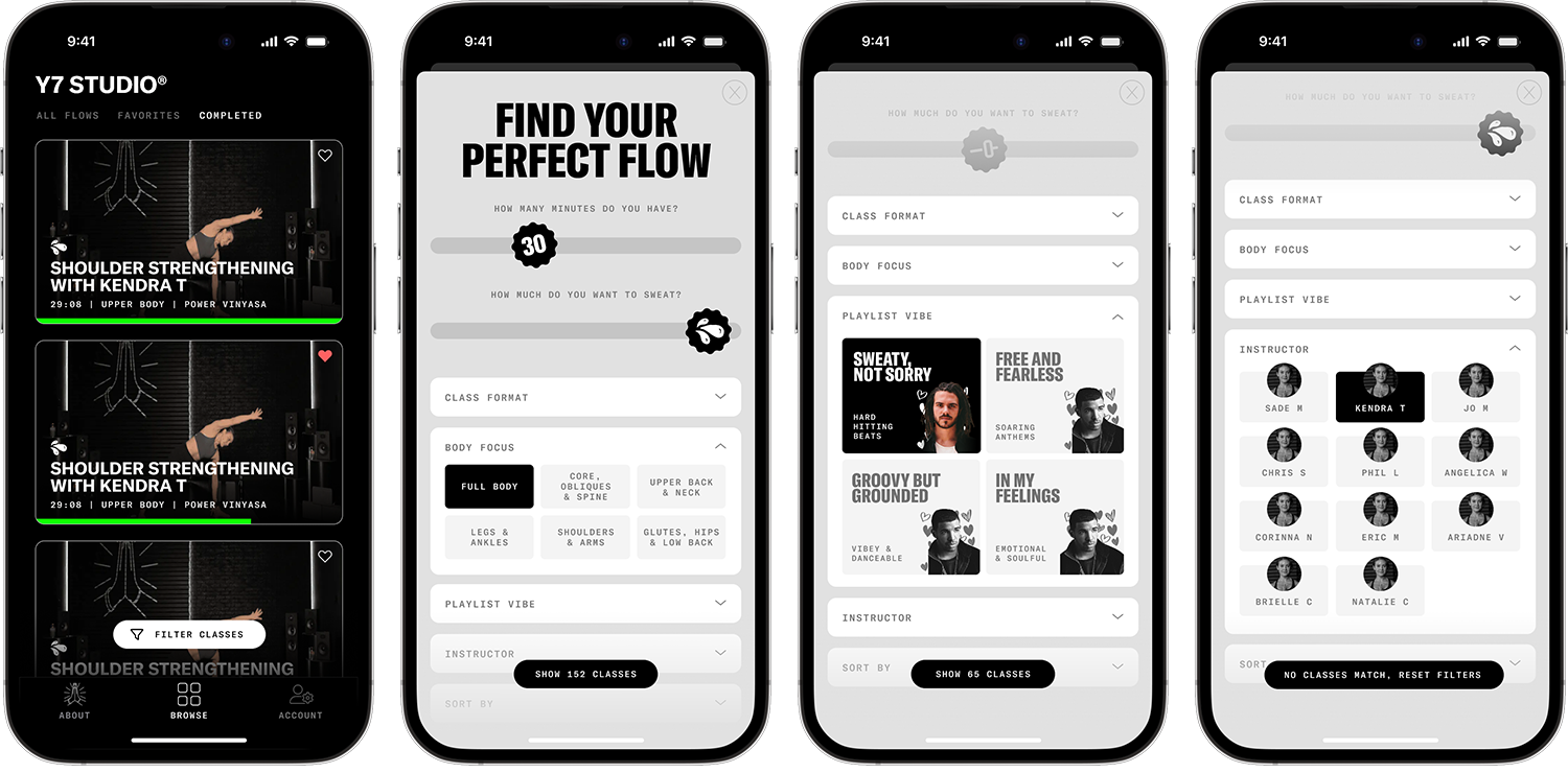
The primary design objective for our refreshed digital product was to improve class discoverability, addressing a major pain point in the user journey. Drawing from best practices across the SVOD fitness landscape, I aimed to design a simple and intuitive UX, enabling users to find their ideal workout in five or less clicks.
BROWSE FUNCTIONALITY
Ideation + Wireframing
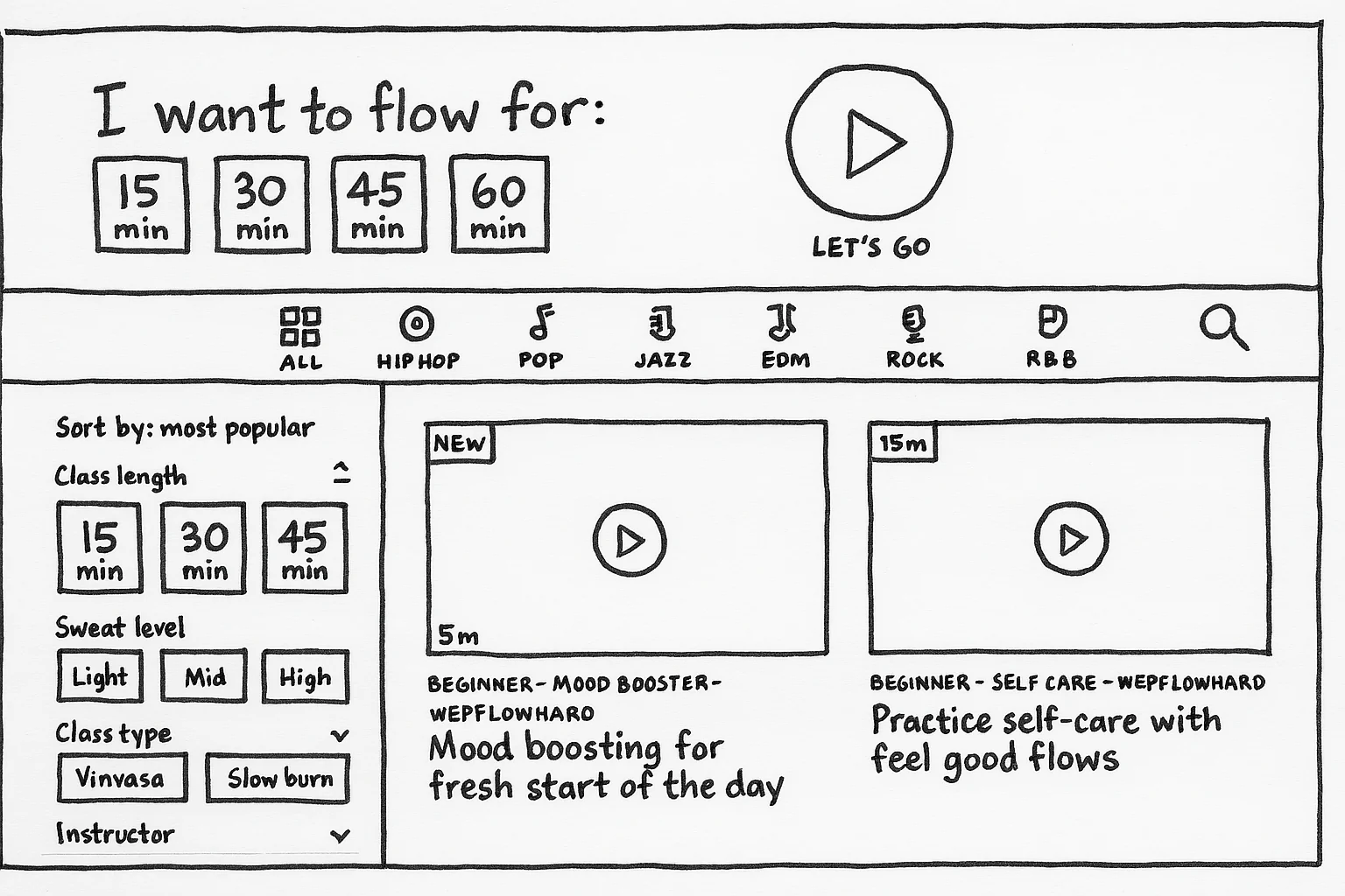
To create a seamless experience, I designed an "I'm Feeling Lucky"-style class selector at the top of the page, allowing users to select the amount of time they had and immediately start a randomized class with just one click. This feature was intended to reduce decision paralysis, letting the platform choose for the user.
I also designed a straightforward filtering system. To emphasize our new hit music integration as a key differentiator, I placed a "genre" filter row prominently above the fold. On the left sidebar, users could access sort options and other filters, with the most popular filters already expanded and more advanced options hidden in an accordion element until needed.
Classes were displayed in a clean, familiar grid format. Each class thumbnail was overlaid with essential information, including duration, sweat level, a progress bar, and a "new" tag for recent uploads. Additional metadata such as class format, category, instructor, and featured artists were shown underneath the thumbnail.
One key decision was whether clicking a class would direct users to a new page or open a modal. While separate pages would benefit SEO and potential user acquisition, modals provided a better user experience by allowing subscribers to easily exit and choose another class. I prioritized user experience and opted for the modal approach:

The modal itself displayed a larger teaser video overlaid with artist thumbnails and CTAs to start the class or bookmark it for later. Below the teaser, users could find class descriptions and metadata like intensity and instructor, followed by the full music playlist. If users discovered a song they liked, they could easily save it to Spotify or Apple Music.
REFINING CLASS DISCOVERY
+ HIGH-FIDELITY PROTOTYPING
I simplified the random class selector, removing the extra click to play and introducing class duration options as fun "sticker" elements. These colorful stickers were placed throughout the UI to add visual interest. The genre row featured rotating artist headshots, negotiated with various label imprints under UMG, elevating our music partnership.
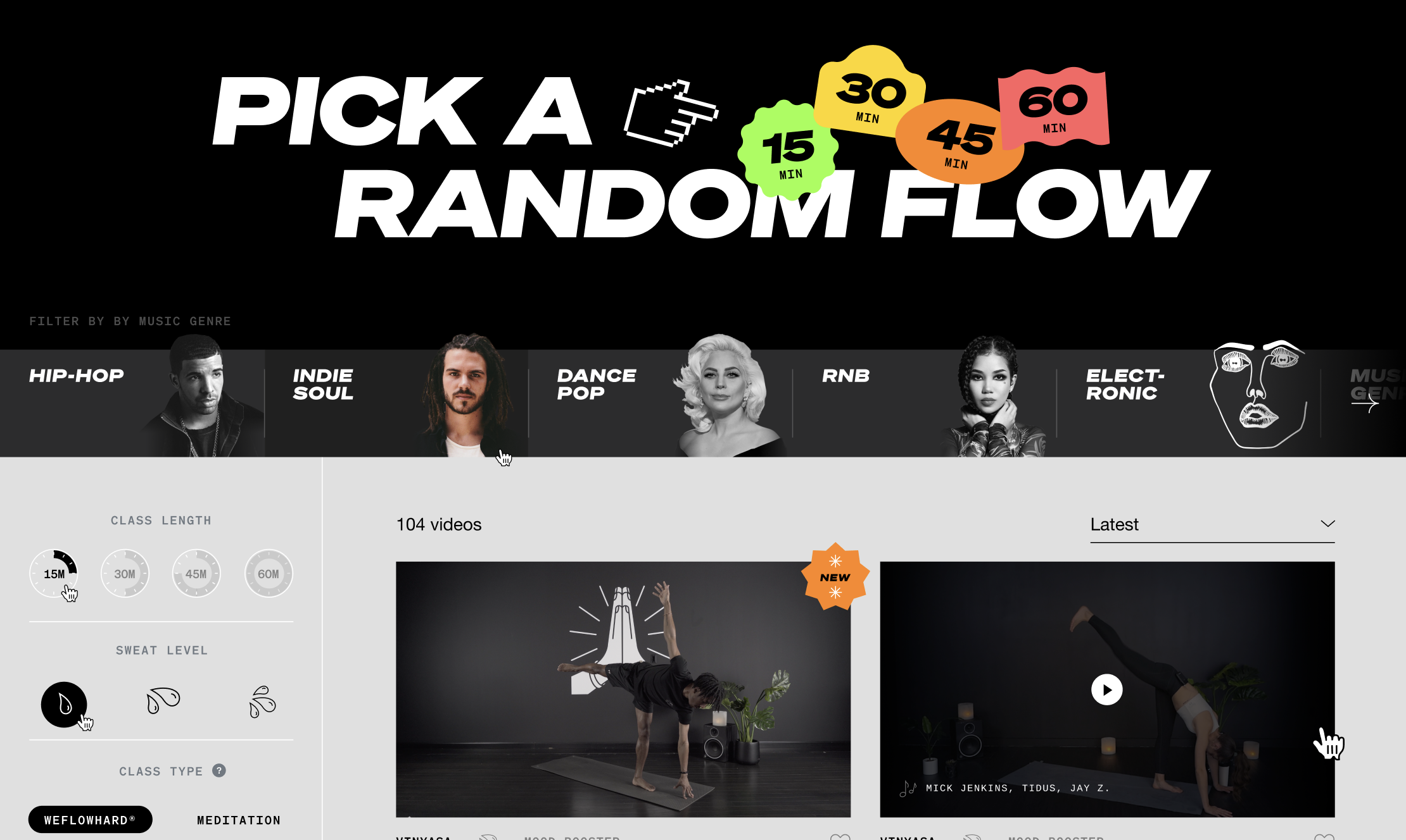
After conducting user interviews and further testing, I reconsidered the utility of both the random class selector and the genre filter. Many classes blended genres, and beta testers weren’t fully utilizing these features.
Instead, I developed a more interactive, quiz-like UX that focused on the two most commonly used filters: duration and intensity. Users could interact with a draggable slider to answer two key questions: "how long do you have?" and "how intense should the workout be?"
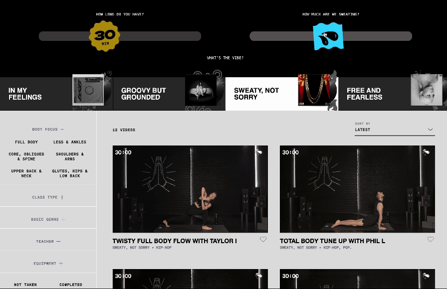
Although I removed the genre filter, I still wanted to highlight our music integration. To do this, we introduced "vibes" that combined multiple genres with an intentional theme for the instruction itself. For example, "Sweaty, Not Sorry" featured high-energy, hip-hop/electronic classes, while "In My Feelings" offered more restorative flows with soulful R&B and indie tracks.
For other filters, I determined that "body focus" provided the most utility, so it was prominently placed at the top of the sidebar, automatically expanded. The remaining filters were collapsed by default, and the sort functionality was moved to the top right of the grid.
I also simplified the metadata visible on the grid to avoid overwhelming users. The thumbnails displayed only the class duration (top left), an intensity icon (top right), and a progress bar (bottom). Below the thumbnail, we featured the class title (which already included the class type and instructor), the vibe, and a heart icon for favoriting or unfavoriting classes.
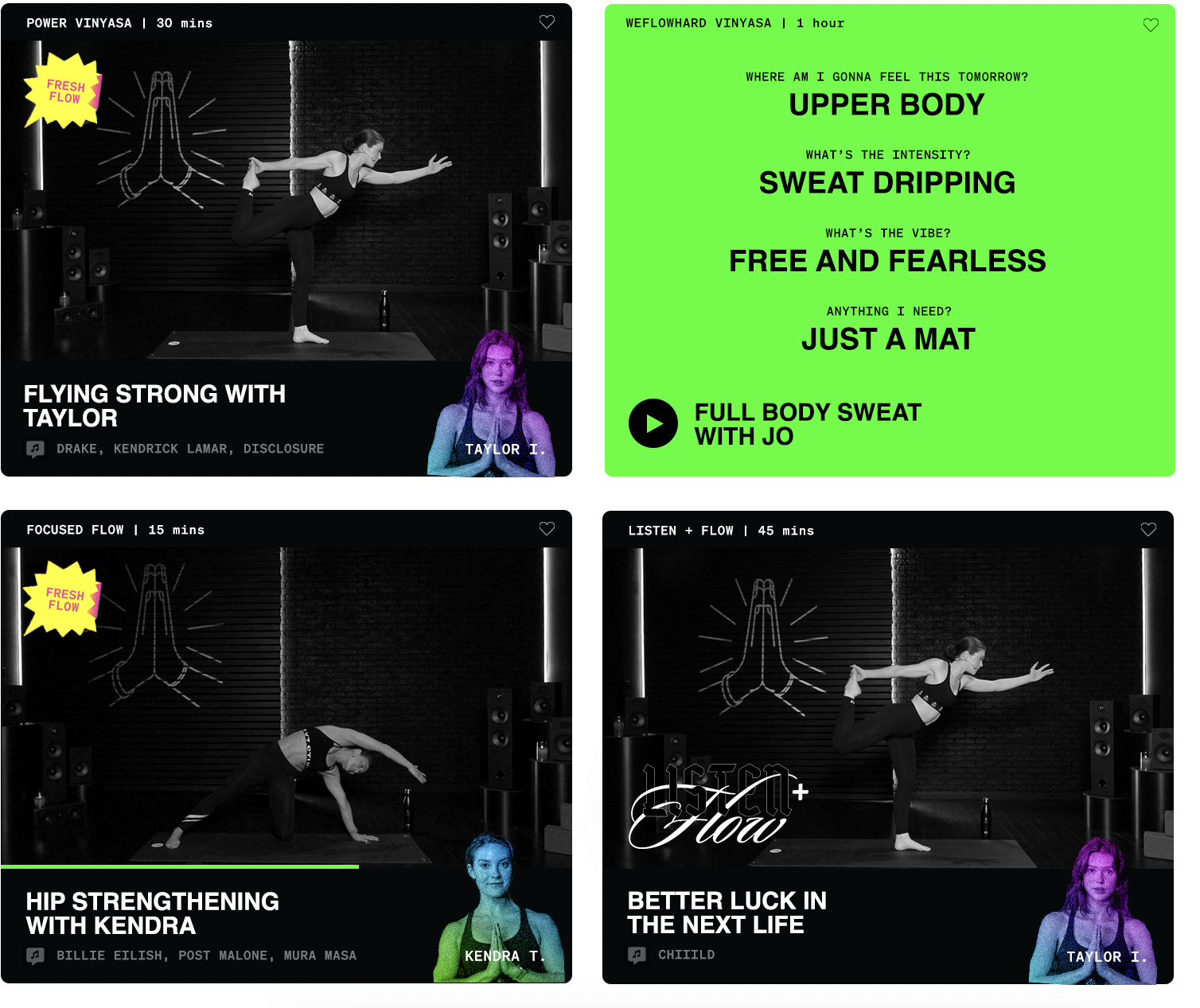
POST-LAUNCH ITERATIONS
After launch, I further designed some iterative refinements to the grid UI, with a cleaner, higher-contrast B&W look that featured a smooth "card flip" animation on hover that would reveal key attributes before needing to click open the modal:
ADAPTING FOR
MOBILE SCREENS
Adapting the design for mobile required a significant shift in layout. The grid was simplified into a single column, and all metadata was placed inside the thumbnail itself. The heart icon was moved to the top right, with the remaining metadata displayed at the bottom left of the thumbnail. At the top of the mobile interface, users could easily toggle between all classes, favorite classes, and completed classes.
For filtering on mobile, I added a prominent "Filter Classes" button, fixed at the bottom of the screen in high contrast. When clicked, this opened a detent sheet containing the duration and intensity sliders, with other filters available in expandable accordion elements. As users applied filters, the available class count updated in real time. A high-contrast button allowed users to apply filters and close the sheet, or they could use a familiar swipe-down gesture to exit.
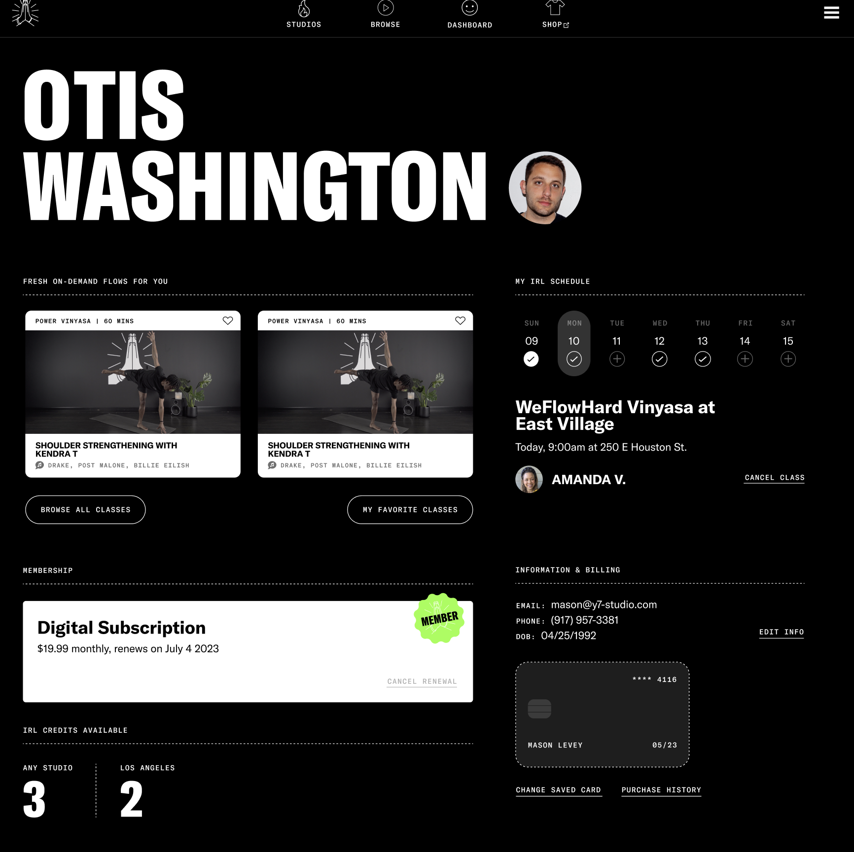
FUTURE OMNICHANNEL
DASHBOARD DESIGN
While pushed back into the development roadmap (per my prioritization strategy) and ultimately not implemented, I also designed UX/UI for a new omnichannel client dashboard – shown directly after logging in – that allowed for one-click access to start digital classes, book studio classes, manage subscriptions, or update billing information:
The primary design objective for our refreshed digital product was to improve class discoverability, addressing a major pain point in the user journey. Drawing from best practices across the SVOD fitness landscape, I aimed to design a simple and intuitive UX, enabling users to find their ideal workout in five or less clicks.
THE ROLE OF POST-LOCKDOWN
DIGITAL FITNESS
To create a seamless experience, I designed an "I'm Feeling Lucky"-style class selector at the top of the page, allowing users to select the amount of time they had and immediately start a randomized class with just one click. This feature was intended to reduce decision paralysis, letting the platform choose for the user.
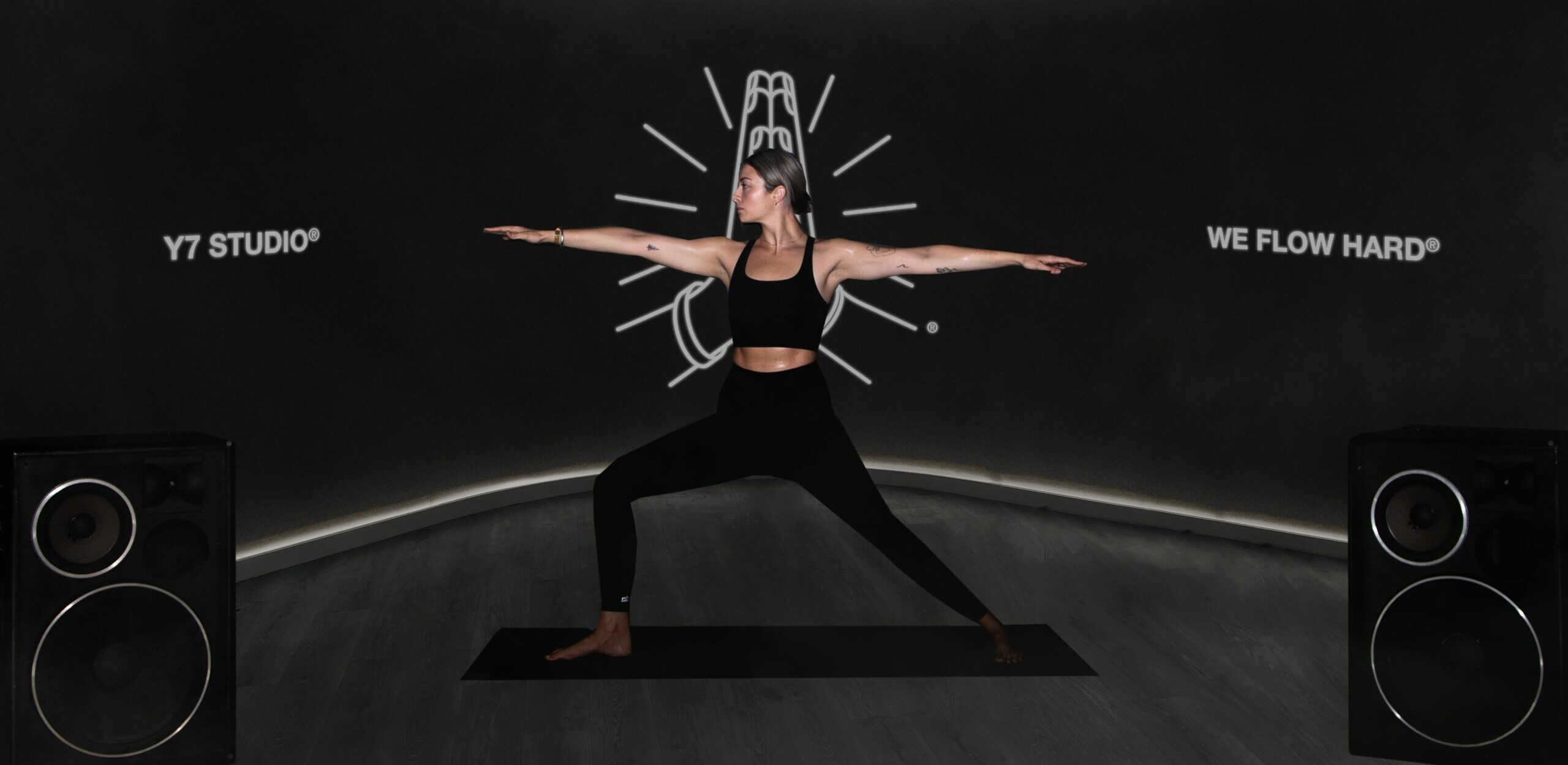
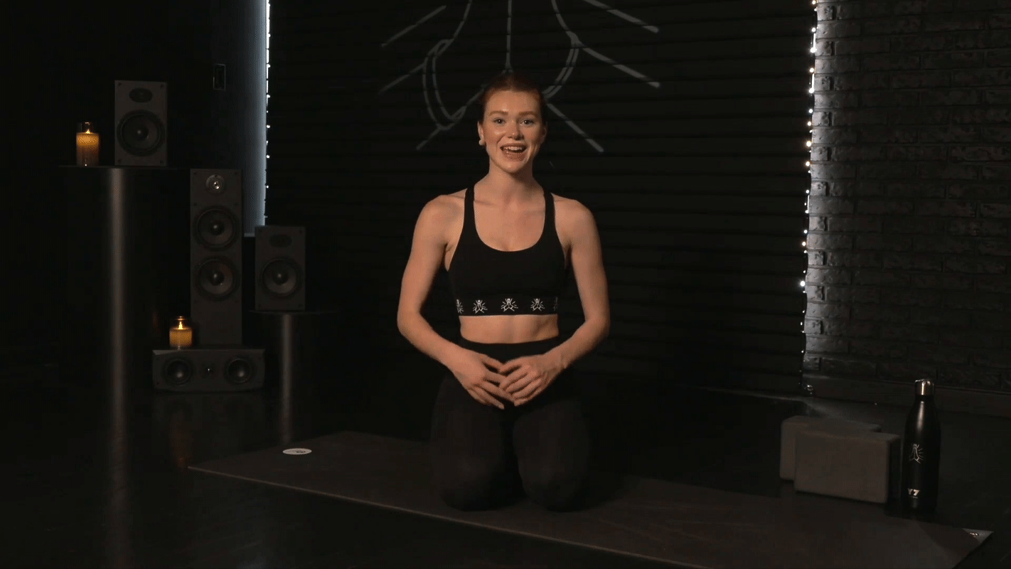
Since our product experience revolved around videos filmed in our production studio, the set design played a crucial role in our overall product design.
Concept development
+ renderings
To differentiate our offering, I aimed to create a set that captured the essence of the Y7 brand while setting our digital content apart. I collaborated with longtime Y7 creative consultant Brad Warsh and Endorphinz studio designer Steven Buono to develop and refine several mockups.
Instead of echoing the popular trend of bright sets, we leaned into Y7’s signature darker aesthetic found in its physical candlelit studios. Early ideas involved clean, curved walls, which—while sleek—lacked a distinctive feel.
Early mockup concept by Brad Warsh

Initial 3D rendering concept by Steven Buono
I wanted the set to reflect Y7's gritty Brooklyn roots and its focus on intense, music-driven experiences. Drawing inspiration from years of iconic brand photography, we sought to elevate the set design.


The final inspiration came from classic New York City elements: brick walls, graffiti, and roll-up garage doors. We incorporated these into the design in a way that balanced character with simplicity, ensuring the set wouldn’t feel too busy or distract from the classes.

Final approved 3D rendering by Steven Buono
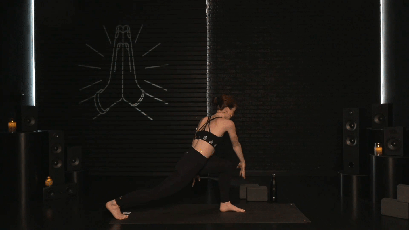
The result featured instructors framed in front of a blacked-out garage door and brick wall, accented by modern lighting and a row of black speakers to highlight our music integration. Instead of graffiti, we used a gobo projector to display Y7's iconic "prayer hands" logo, which could easily be swapped out for brand partnerships or special activation classes.
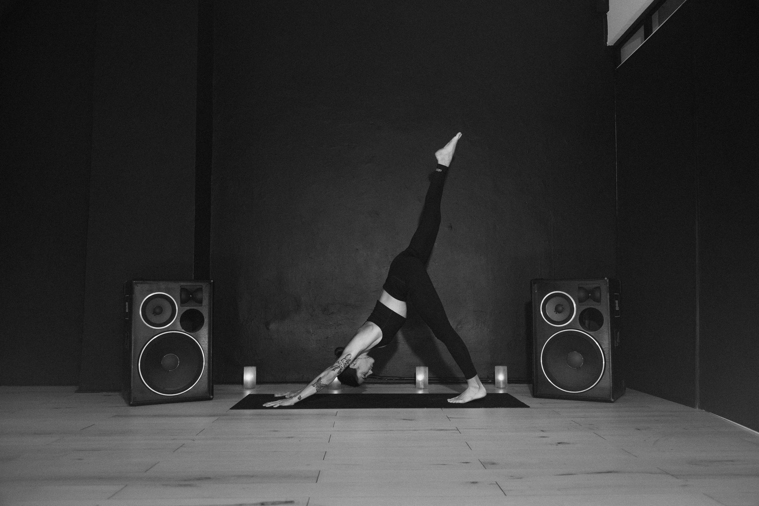
Final build +
camera setup
The final build closely followed our rendering, with the addition of candles to evoke Y7’s signature candlelit studio experience. We also installed a second PTZ camera, allowing us to start and end classes with a more intimate close-up shot—mimicking the feeling of sitting beside the instructor in a private session. This complemented the wide, full-body shots that captured the dynamic range of movement essential to vinyasa yoga. Tally lights were deployed to ensure talent always made eye contact with the correct camera throughout the session.
This thoughtful set design not only enhanced the visual appeal of our videos but also reinforced the distinctive Y7 brand in every class.
Mainstream digital fitness offerings all featured hit music integration, and beat bumping flows was a signature element of the Y7 experience itself. Thus, to be competitive and true to the brand, music had to integral to the product.
EXPLORING
OUR OPTIONS
Some competitors, like obé, featured a feed.fm integration which offered shuffle-style randomized playback on pre-curated "radio stations." Unfortunately, this meant having virtually no control over what songs played when during a class, potentially creating a jarring class experience in the yoga context.
The alternative, a sync license, was expensive and cumbersome. This required complex and lengthy legal negotiations with various rightsholders, and would substantially alter our cost structure through a top-line revenue-sharing model.
Ultimately, I opted for the sync route, with a wrinkle: I'd pitch an exclusive partnership to Universal Music Group, the world's largest label group. This route, while limiting our selection to the UMG catalog, would offer both sizable cost savings in legal fees and a discount to our revenue-sharing rates. Choosing UMG over Warner and Sony both offered us a larger exclusive library,
PITCHING +
NEGOTIATIONS
TBD
MANAGING CROSS-FUNCTIONAL
STAKEHOLDERS
Securing and implementing this partnership required collaboration across all facets of the business: finance, engineering, content, and marketing.
DRIVING INTEGRATIVE
VALUE
Securing and implementing this partnership required collaboration across all facets of the business: finance, engineering, content, and marketing.
Improving discoverability wouldn't matter without drastically more content to discover, which required a complete overhaul of our end-to-end production process to dramatically scale monthly output. This involved months of redesigning processes, expanding the team, and developing low-code interfaces.
DIAGNOSING
OPERATIONAL
FLAWS
When I joined Y7, content production was highly manual and disorganized. We relied on reaching out to individual teachers to fit their availability into ad-hoc filming sessions, and offered no guidance for programming. Files were physically couriered to and from an editor. The only tracking existed in a basic spreadsheet, and about 5% of filmed classes got lost somewhere along the process.
STREAMLINING
END-TO-END
PRODUCTION
I transitioned to a smaller, permanent roster of digital teachers who excelled in the format and could consistently film during predictable, recurring time-slots. I then designed a structured scheduling process—where talent was pre-assigned a rotating class format, body focus, and vibe—to ensure any combination of our most-used attribute filters always delivered a balanced number of results.
Our filming process was upgraded to an efficient 2-camera PTZ operation, which was edited live by a single operator and reduced post-production labor by 90%. This achieved substantial savings in the cost per minute of content published, which was 60% lower than competitors with comparable quality.
Finally, I revamped the QC process into a peer review system. On-screen talent reviewed each other's classes using a standardized rubric, clarified any missing attributes (e.g. intensity), and approved classes for publishing to the CMS. This ensured rigorous quality control while helping instructors sharpen their own content through a clearer understanding of the feedback process.
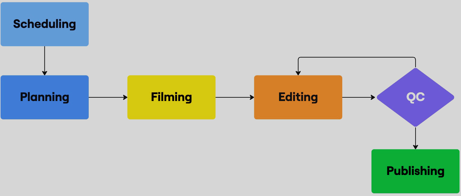
CREATING A SINGLE
SOURCE OF TRUTH
To manage the increased volume of 15x more classes per month, the old system was no longer feasible. Using Airtable, I built a comprehensive tracking database with custom interfaces for each stage of the production pipeline. This was linked to Frame.io, our new cloud storage platform, to ensure video files were always accounted for and correctly versioned.
These efforts created a central source of truth that minimized errors and content losses. Each production phase had its own tailored interface that streamlined & validated their respective administrative workloads, while I created my own master dashboard that could quickly identify—and solve for—bottlenecks.
RESULTS
Through continuous refinement of these interfaces and processes, I transformed the content production process into a well-oiled operation that scaled our monthly production by 15x, increased back-office efficiency, and improved overall quality.
To launch and market our re-imagined offering, I had to develop a comprehensive go-to-market strategy with clear positioning that targeted our dual personas: up-selling existing studio clients, and swaying at-home advanced yogis.
Positioning & Messaging
LEANING INTO OUR
UNIQUE STRENGTHS
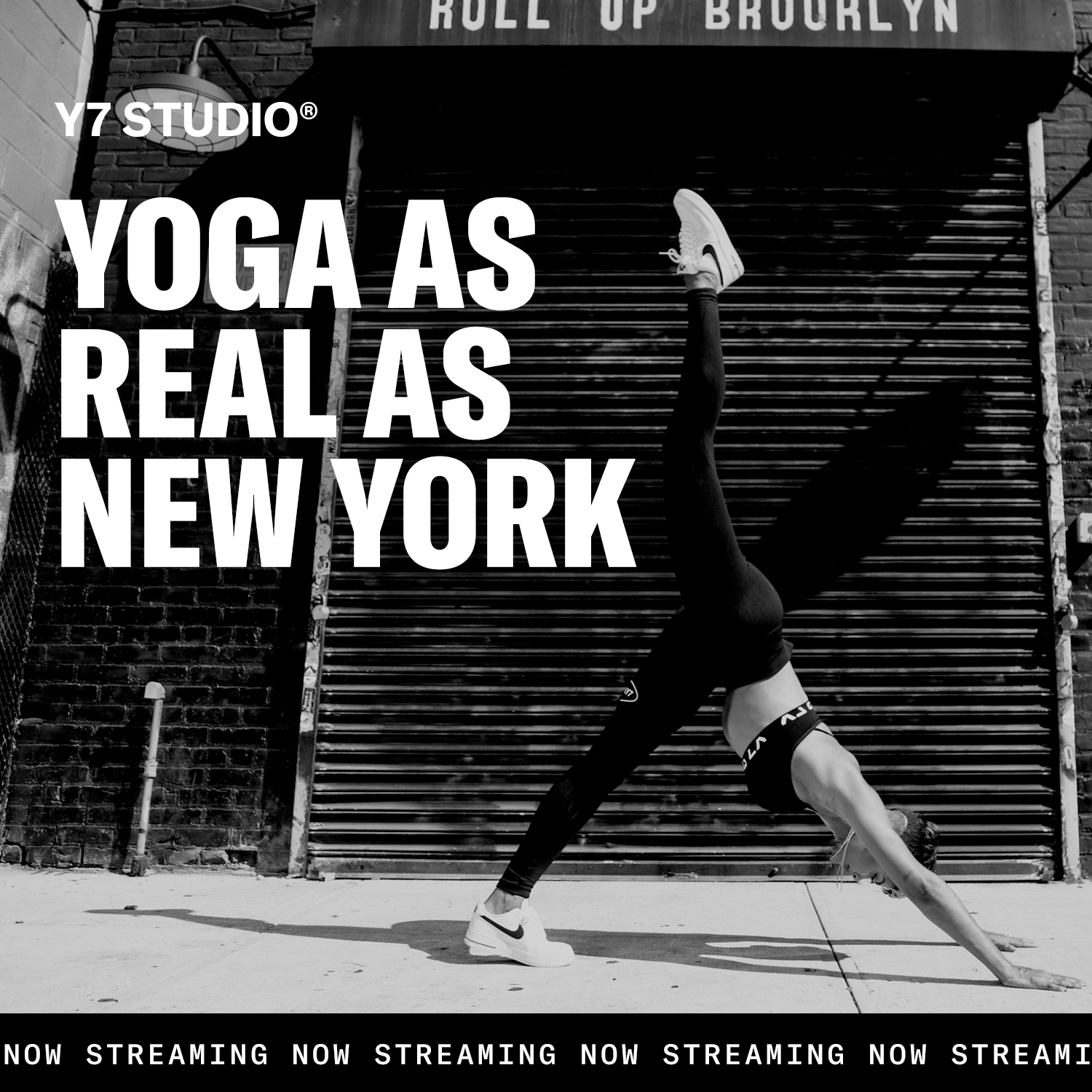
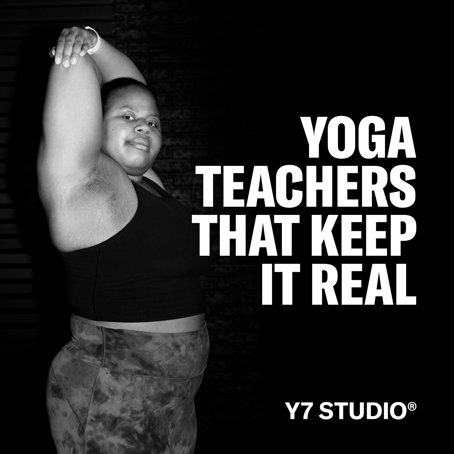
After brainstorming messaging and conducting user interviews, I landed on the primary tagline "The Internet's Sweatiest Yoga" to stake a defensible claim in our targeted niche. This front-and-center emphasis – paired with vivid, sweat-dripping imagery – made it clear to prospective users what our product was all about.

Above-the-fold hero section on digital landing page.
We followed this up with the social proof and reputability of Y7's brick-and-mortar brand, a cult favorite in NYC & LA for over ten years, which was a unique positioning advantage that purely digital platforms lacked.

Music emphasis was a surprisingly ineffective draw in marketing messaging, as most consumers expected this integration as table stakes for a digital fitness platform. Instead, I found greater success through experimenting with emphasizing our authentic, deeply relatable, and diverse teachers and gritty "NYC" aesthetic.

Unlocking Organic Traffic
UP-SELLING STUDIO
CLIENTS
Our strongest marketing channel was the existing organic traffic for Y7's popular physical studios. Taking advantage of the account unification in our new omnichannel platform, I implemented a one-click checkbox up-sell that allowed studio clients booking their first brick-and-mortar class to seamlessly add on a free trial for digital classes – increasing daily new trials by nearly 20%.

Modal for new studio clients that featured a one-click digital trial up-sell.
New User Onboarding
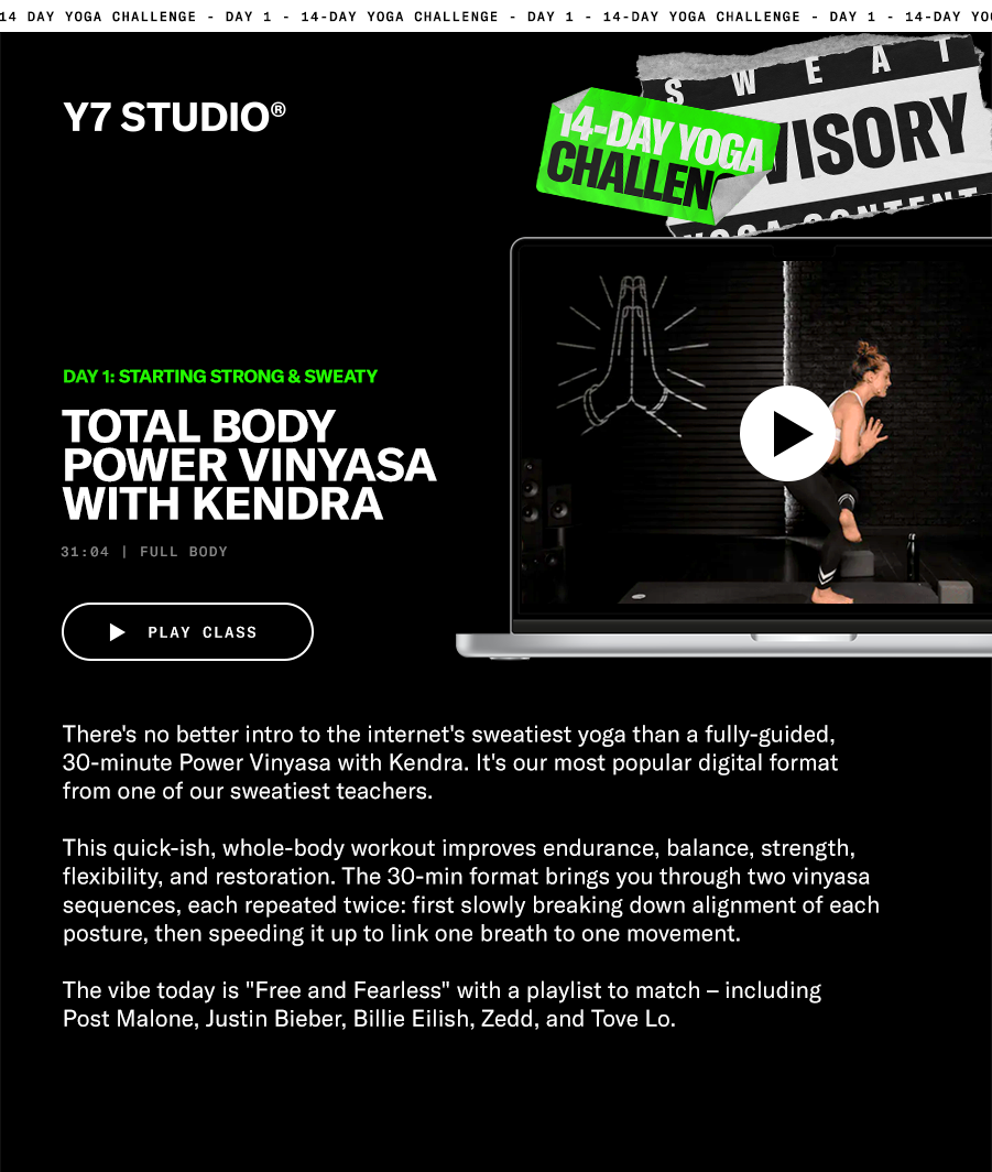
TURNING A TRIAL
INTO A CHALLENGE
To increase user acquisition and early engagement, I re-positioned our free trial as a 14-day yoga challenge. Collaborating with our yoga lead to curate some of our best classes, we emailed daily classes that introduced different teachers, formats, body focuses, and vibes to new trial users.
The switch to "challenge" positioning had the measurable impact of increasing new trials started by 10%, trial conversion by 15%, and paid ad CTR by 20%.